UI Challenge 5 – Parallax Effect by Marcus Engstrup Dresler
Hi there. I’m back again.
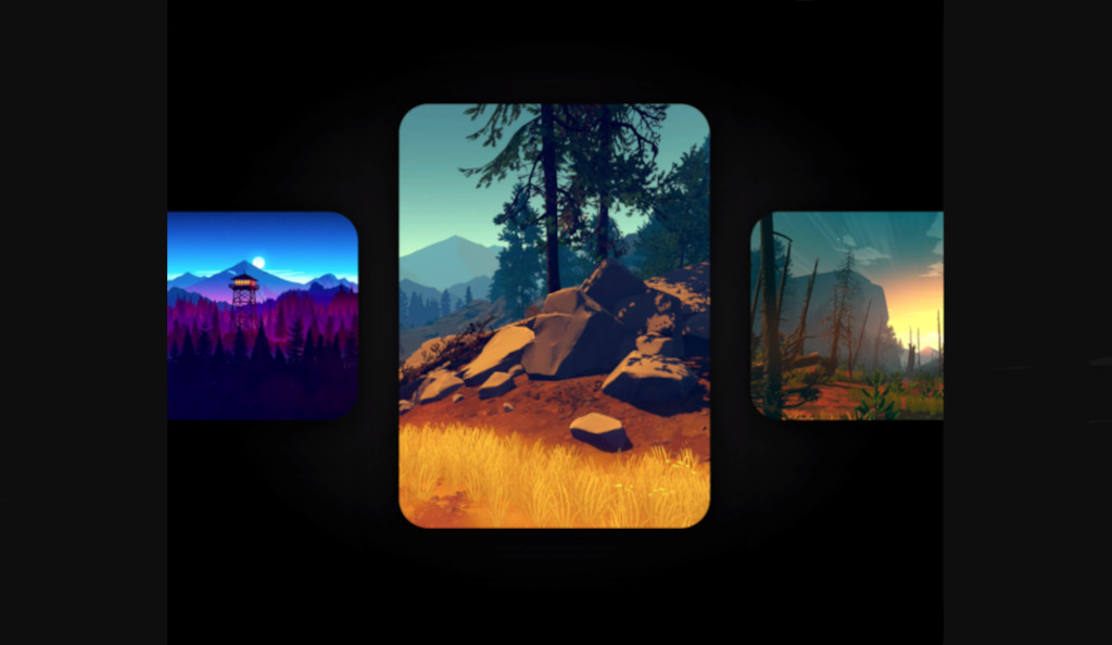
Today I decided to write a blog post here. After a little search in the Dribbble I found this amazing design here by Marcus Engstrup Dresler.
Okay, let’s break it into some small challenges to solve. First of all, we need to have a single image which supports parallax effect, then we need to put list of images inside a horizontal list and make them parallax based on their offset in the list.
1. SlidingImage
For achieving parallax effect on an image, we need to show part of our image. We can use Alignment in the Image widget to achieve that.
Alignment takes x and y which should be between -1.0 and +1.0. In our case, we need to use only X value (-1.0 means left, +1.0 means right, and 0.0 is center)
class ParallaxImage extends StatelessWidget {
  final String url;
  final double horizontalSlide;

  const ParallaxImage({
    Key? key,
    required this.url,
    required this.horizontalSlide,
  }) : super(key: key);

  @override
  Widget build(BuildContext context) {
    return Image.network(
      imageUrl,
      alignment: Alignment(horizontalSlide, 1),
      fit: BoxFit.cover,
    );
  }
}
2. Horizontal Scroll List
Now let’s focus on making a horizontal list with a simple widget (like a colored box). There is a widget called PageView that can use it for implementing a horizontal list (with snapping effect).
Below is a simple example of PageView
@override
Widget build(BuildContext context) {
  return Scaffold(
    body: Center(
      child: AspectRatio(
        aspectRatio: 2.0,
        child: PageView(
          controller: PageController(
            initialPage: 1,
            viewportFraction: 0.6,
          ),
          children: [
            ColoredBox(color: Colors.red),
            ColoredBox(color: Colors.green),
            ColoredBox(color: Colors.blue),
          ],
        ),
      ),
    ),
  );
}
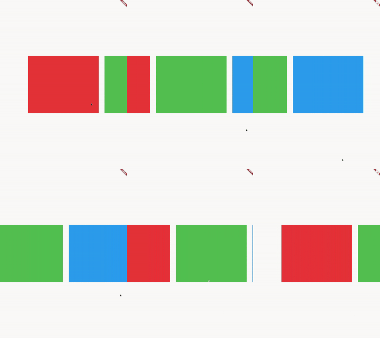
Now we need to calculate the offset of each box and let them now their offset value.
We can get the page value using PageController which contains a value that shows the offset of our PageView.
late PageController _pageController;
double page = 0.0;

@override
void initState() {
  _pageController = PageController(
    initialPage: 1,
    viewportFraction: 0.6,
  );
  _pageController.addListener(() {
    setState(() {
      page = _pageController.page!;
    });
  });
  super.initState();
}

@override
Widget build(BuildContext context) {
  return Scaffold(
    body: Center(
      child: AspectRatio(
        aspectRatio: 2.0,
        child: PageView(
          controller: _pageController,
          children: [
            ColoredBox(color: Colors.red),
            ColoredBox(color: Colors.green),
            ColoredBox(color: Colors.blue),
          ],
        ),
      ),
    ),
  );
}
Now let’s use PageView.builder to access the index of each item (also it improves the performance)
Then we can calculate the offset of each item using page - index formula. Then we clamp the result between -1 and +1:
PageView.builder(
  controller: _pageController,
  itemBuilder: (context, index) {
    return ColoredBox(
      color: colors[index],
      offset: (index - page).clamp(-1, 1).toDouble(),
    );
  },
  itemCount: colors.length,
),
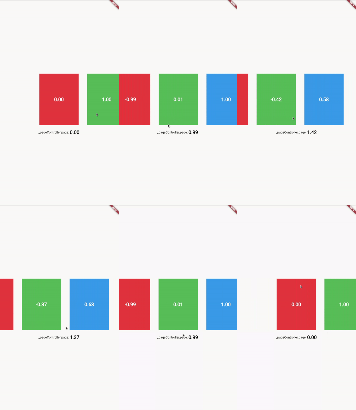
Now we can replace our colored boxes with our ParallaxImage widget and use the horizontalSlide value to slide each image.
PageView.builder(
  controller: _pageController,
  itemBuilder: (context, index) {
    return Padding(
      padding: const EdgeInsets.all(16.0),
      child: ParallaxImage(
        url: images[index],
        horizontalSlide: (index - page).clamp(-1, 1).toDouble(),
      ),
    );
  },
  itemCount: images.length,
)
Okay, now let’s change the width and height of each image based on their offset. Also, we need to make images rounded by wrapping them in a ClipRRect widget.
class ParallaxImage extends StatelessWidget {
  final String url;
  final double horizontalSlide;

  const ParallaxImage({
    Key? key,
    required this.url,
    required this.horizontalSlide,
  }) : super(key: key);

  @override
  Widget build(BuildContext context) {
    final scale = 1 - horizontalSlide.abs();
    final size = MediaQuery.of(context).size;
    return Container(
      child: Center(
        child: SizedBox(
          width: size.width * ((scale * 0.8) + 0.8),
          height: size.height * ((scale * 0.2) + 0.2),
          child: ClipRRect(
            borderRadius: BorderRadius.all(Radius.circular(48)),
            child: Image.network(
              url,
              alignment: Alignment(horizontalSlide, 1),
              fit: BoxFit.cover,
            ),
          ),
        ),
      ),
    );
  }
}
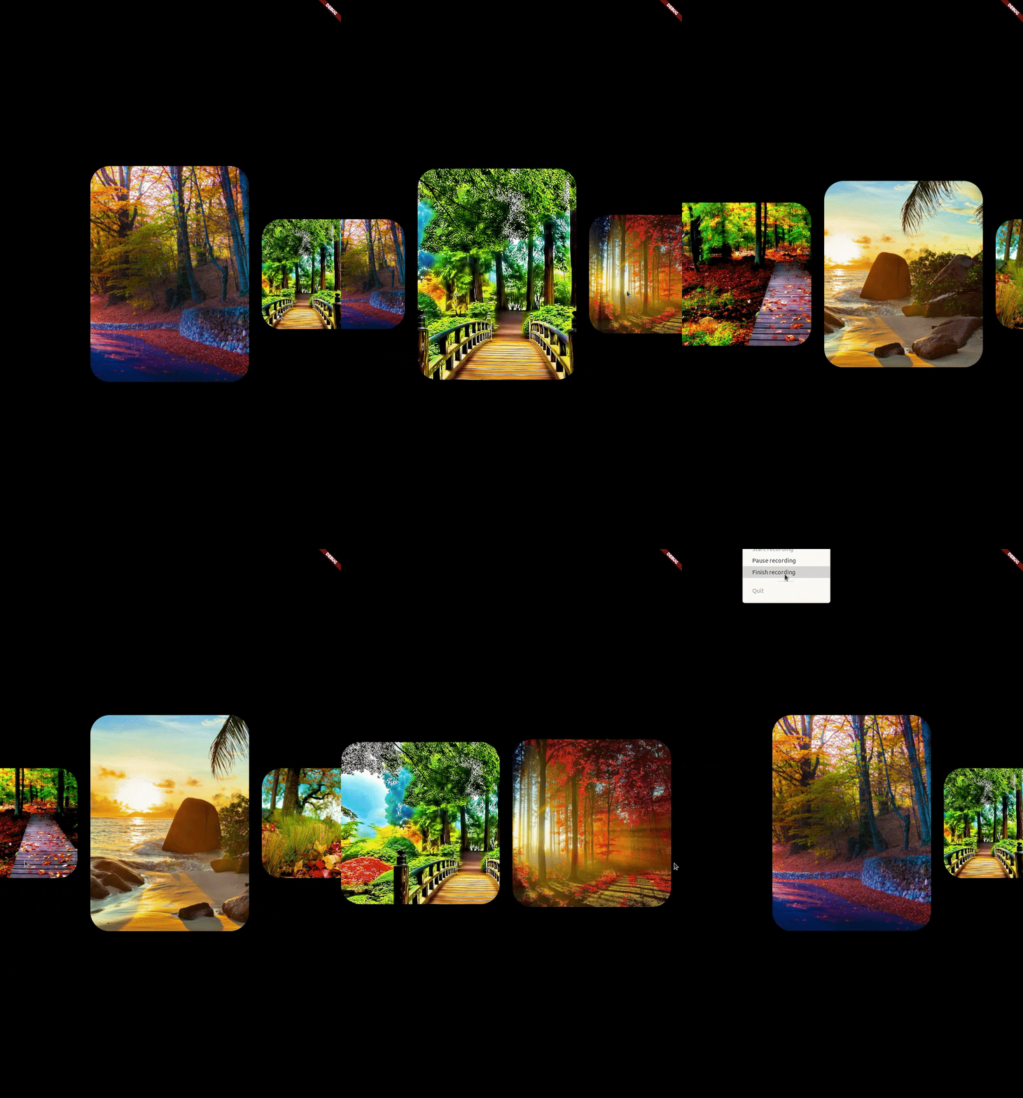
I think there is nothing left except replacing images. Unfortunately, I couldn’t find images that have been used in our reference video. If you found them you can replace them easily.
You can find the source code here in my Github.
Don’t forget to comment and write your feedback.
Thanks for reading!

Wow !! It feels great to see this widget :clap:
Love this format! Subject was interesting and we’re done! Can’t wait for the next challenge.
Hi, just required you to know I he added your site to my Google bookmarks due to your layout. But seriously, I believe your internet site has 1 in the freshest theme I??ve came across. It extremely helps make reading your blog significantly easier.