
Hi guys.
Happy to write again!
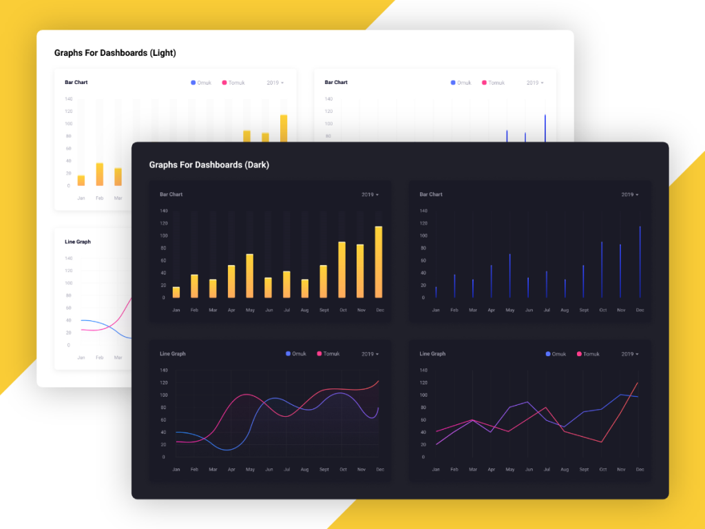
Today I found this fantastic design from Rayhanul Islam (check it in the Uplabs).
In this article, we are going to implement and explain it step by step.
This session is special because we are going to cover these aspects:
- Implement it in responsive way (to support all screens from mobile to desktop)
- Use fl_chart package to implement the charts.
- Implement dark / light themes
1. The layout structure
As you remember, we need to break a big problem into some smaller ones.
In this section, we will focus on the layout structure (Nothing more).
As you see we need to make a grid-like layout to show some cards.
Each card should be in a 1.7:1 aspect ratio (width = height * 1.7).
We can use the GridView widget to implement our grid with 2 columns.
(notice that GridView has a childAspectRatio property to apply the aspect ratio to each child)
class HomePage extends StatelessWidget {
  const HomePage({Key? key}) : super(key: key);

  @override
  Widget build(BuildContext context) {
    return Scaffold(
      backgroundColor: Colors.blueGrey,
      body: GridView.count(
        crossAxisCount: 2,
        childAspectRatio: 1.7,
        padding: const EdgeInsets.all(16),
        crossAxisSpacing: 16,
        mainAxisSpacing: 16,
        children: const [
          Card(),
          Card(),
          Card(),
          Card(),
        ],
      ),
    );
  }
}
As you may notice, our design is not responsive. In some small devices, we need to show 1 column (instead of 2).
To implement it, we need to wrap our GridView with a LayoutBuilder. In this way, we have access to width and height of our parent view (which is the scaffold’s body). Then we can check if the width is lower than 800, we should show the grid with 1 column. Otherwise, we show it with 2 columns.
class HomePage extends StatelessWidget {
  const HomePage({Key? key}) : super(key: key);

  @override
  Widget build(BuildContext context) {
    return Scaffold(
      backgroundColor: Colors.blueGrey,
      body: LayoutBuilder(
        builder: (context, constraints) {
          return GridView.count(
            crossAxisCount: constraints.maxWidth < 800 ? 1 : 2,
            childAspectRatio: 1.7,
            padding: const EdgeInsets.all(16),
            crossAxisSpacing: 16,
            mainAxisSpacing: 16,
            children: const [
              Card(),
              Card(),
              Card(),
              Card(),
            ],
          );
        }
      ),
    );
  }
}
2. Fl Chart

Now we are ready to implement the charts. We use the fl_chart package.
The fl_chart is a flutter library that allows you to implement different types of charts. At this time, it supports LineChart, BarChart, PieChart, ScatterChart, and RadarChart.
You can read the library documentation to get started.
Also, you can check our posts about the fl_chart here.
Let’s add it to our project. There is an installation guide here.
We only need to add fl_chart: ^latest_version in your pub.dev file like below:
dependencies:
  fl_chart: ^0.40.2
Now we are ready to import and use it in our project.
import 'package:fl_chart/fl_chart.dart';
3. BarChart
Let’s start by implementing the first BarChart sample:
In the fl_chart package, there is a BarChart class that allows you to implement any kind of bar chart (grouped bar chart, stacked bar chart, …).
There is a required argument that you must provide. You must provide a BarChartData to the BarChart class like below:
BarChart(
  BarChartData(
    // Anything that describes the chart
  ),
),
In the BarChartData, there are a bunch of optional arguments which you can use to customize your chart.
You can read about all of them here.
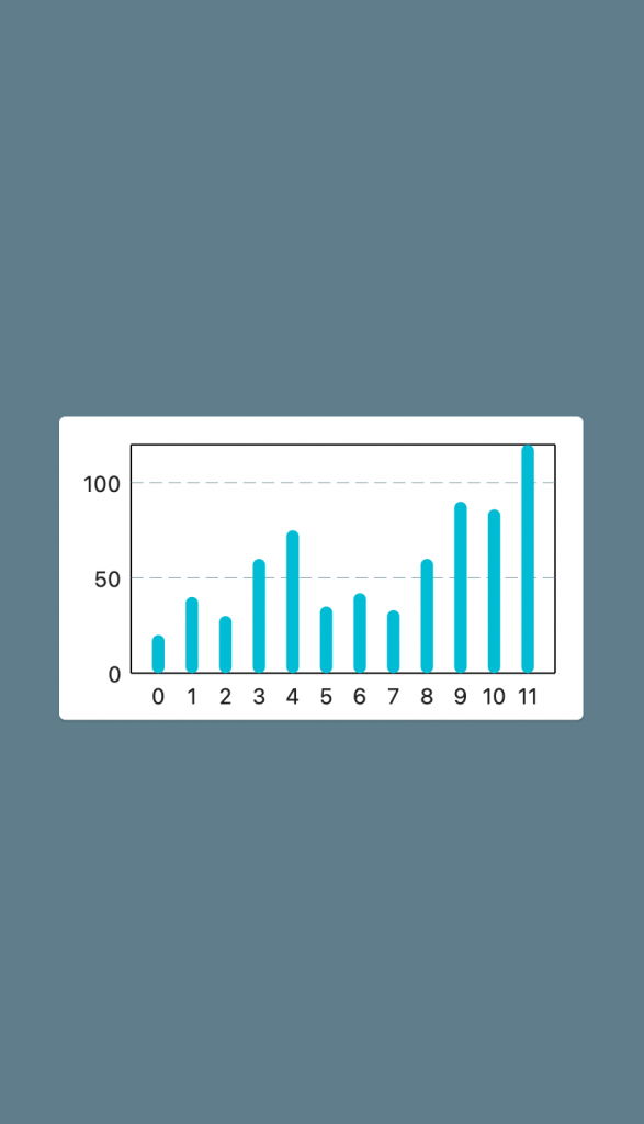
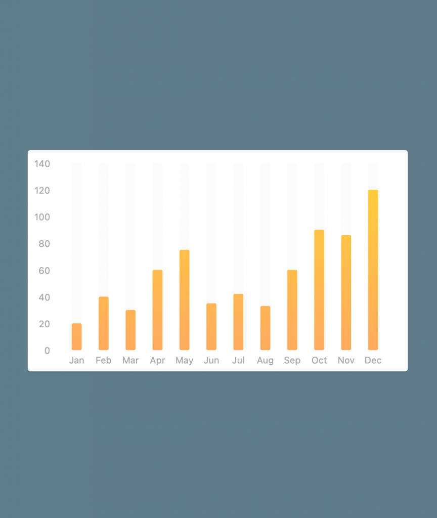
For example, there is a parameter called barGroups. It gets a list of BarChartGroupData. Each group is responsible to show a group of bars. For example below sample has 7 groups and each group contains two BarChartRodData.

In our design, we need to have 12 barGroups, and each group should contain only 1 rod.
BarChart(
  BarChartData(
    barGroups: [
      BarChartGroupData(x: 0, barRods: [BarChartRodData(y: 20)]),
      BarChartGroupData(x: 1, barRods: [BarChartRodData(y: 40)]),
      BarChartGroupData(x: 2, barRods: [BarChartRodData(y: 30)]),
      BarChartGroupData(x: 3, barRods: [BarChartRodData(y: 60)]),
      BarChartGroupData(x: 4, barRods: [BarChartRodData(y: 75)]),
      BarChartGroupData(x: 5, barRods: [BarChartRodData(y: 35)]),
      BarChartGroupData(x: 6, barRods: [BarChartRodData(y: 42)]),
      BarChartGroupData(x: 7, barRods: [BarChartRodData(y: 33)]),
      BarChartGroupData(x: 8, barRods: [BarChartRodData(y: 60)]),
      BarChartGroupData(x: 9, barRods: [BarChartRodData(y: 90)]),
      BarChartGroupData(x: 10, barRods: [BarChartRodData(y: 86)]),
      BarChartGroupData(x: 11, barRods: [BarChartRodData(y: 120)]),
    ]
  ),
),
Great! We need to add some padding to the bottom (we simply can wrap our chart into a Padding widget). We also need to hide the right titles.
To do that, we can customize the titlesData property of our BarChartData. It gets a FlTitlesData which you can customize everything about the titles.
Padding(
  padding: const EdgeInsets.only(right: 18, top: 18, bottom: 18),
  child: BarChart(
    BarChartData(
      barGroups: [
        BarChartGroupData(x: 0, barRods: [BarChartRodData(y: 20)]),
        BarChartGroupData(x: 1, barRods: [BarChartRodData(y: 40)]),
        BarChartGroupData(x: 2, barRods: [BarChartRodData(y: 30)]),
        BarChartGroupData(x: 3, barRods: [BarChartRodData(y: 60)]),
        BarChartGroupData(x: 4, barRods: [BarChartRodData(y: 75)]),
        BarChartGroupData(x: 5, barRods: [BarChartRodData(y: 35)]),
        BarChartGroupData(x: 6, barRods: [BarChartRodData(y: 42)]),
        BarChartGroupData(x: 7, barRods: [BarChartRodData(y: 33)]),
        BarChartGroupData(x: 8, barRods: [BarChartRodData(y: 60)]),
        BarChartGroupData(x: 9, barRods: [BarChartRodData(y: 90)]),
        BarChartGroupData(x: 10, barRods: [BarChartRodData(y: 86)]),
        BarChartGroupData(x: 11, barRods: [BarChartRodData(y: 120)]),
      ],
      titlesData: FlTitlesData(
        rightTitles: SideTitles(showTitles: false),
        topTitles: SideTitles(showTitles: false),
      )
    ),
  ),
),
It seems better now. At this time, we need to customize the bottom and left titles.
Bottom titles should be Jan, Feb, Mar, … (instead of 1, 2, 3)
To do that, we can override getTitles property of SideTitles. It gives us an x value (which is a double), and gets a string to show at the x value location.
We can simply map those numbers to the month names.
titlesData: FlTitlesData(
  rightTitles: SideTitles(showTitles: false),
  topTitles: SideTitles(showTitles: false),
  bottomTitles: SideTitles(
    showTitles: true,
    getTitles: (xValue) {
      switch (xValue.toInt()) {
        case 0: return 'Jan';
        case 1: return 'Feb';
        case 2: return 'Mar';
        case 3: return 'Apr';
        case 4: return 'May';
        case 5: return 'Jun';
        case 6: return 'Jul';
        case 7: return 'Aug';
        case 8: return 'Sep';
        case 9: return 'Oct';
        case 10: return 'Nov';
        case 11: return 'Dec';
        default: throw StateError('Not supported');
      }
    }
  )
)
We can also override getTextStyles to customize the color and size of the titles. For example:
bottomTitles: SideTitles(
  showTitles: true,
  getTitles: (xValue) {
    switch (xValue.toInt()) {
      case 0: return 'Jan';
      case 1: return 'Feb';
      case 2: return 'Mar';
      case 3: return 'Apr';
      case 4: return 'May';
      case 5: return 'Jun';
      case 6: return 'Jul';
      case 7: return 'Aug';
      case 8: return 'Sep';
      case 9: return 'Oct';
      case 10: return 'Nov';
      case 11: return 'Dec';
      default: throw StateError('Not supported');
    }
  },
  getTextStyles: (context, xValue) => const TextStyle(
    color: Colors.pink,
    fontWeight: FontWeight.bold,
  ),
)
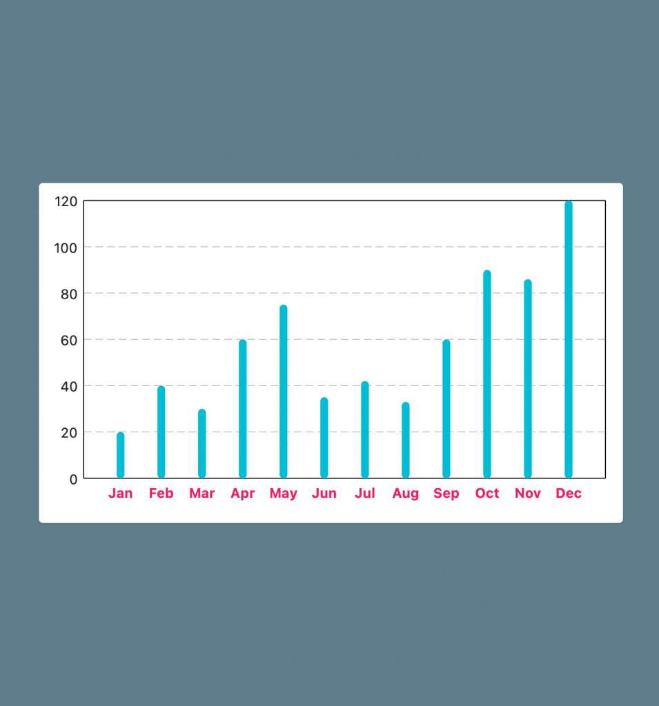
As an alternative way, you can change the TextTheme.bodyText2 in your ThemeData to change the text styles. (fl_chart is theme-aware and updates texts style based on your current theme)
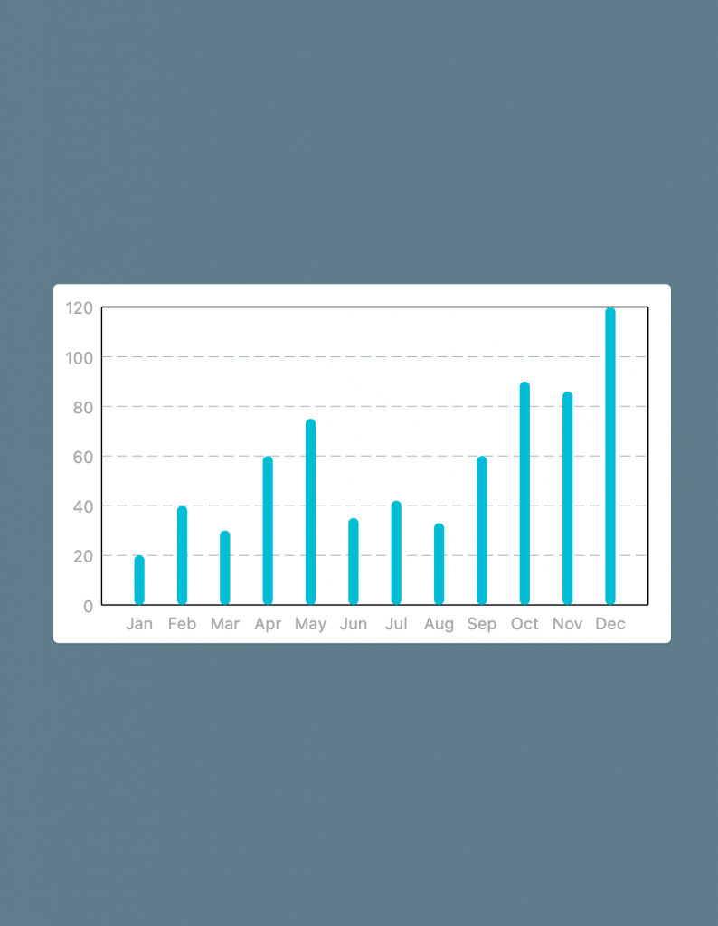
Okay now let’s modify the left titles.
Left titles should be 0, 20, 40, … (incremental by 20)
In the SideTitles class, there is an interval property that determines the steps between each value.
For example in our case, we want to set it to 20.
fl_chart calculates a perfect number to set the interval based on your chart’s size to be responsive.
But if we change it, it will be always the same value on all screen sizes. We will change it to hard-coded 20.
As you see 100 and 120 numbers are written in two lines. To solve this issue, we need to increase the reservedSize property of our SideTitles to give the chart more space to write numbers.
Here is our result so far:
child: Card(
  child: Padding(
    padding: const EdgeInsets.only(right: 18, top: 18, bottom: 18),
    child: BarChart(
      BarChartData(
        barGroups: [
          BarChartGroupData(x: 0, barRods: [BarChartRodData(y: 20)]),
          BarChartGroupData(x: 1, barRods: [BarChartRodData(y: 40)]),
          BarChartGroupData(x: 2, barRods: [BarChartRodData(y: 30)]),
          BarChartGroupData(x: 3, barRods: [BarChartRodData(y: 60)]),
          BarChartGroupData(x: 4, barRods: [BarChartRodData(y: 75)]),
          BarChartGroupData(x: 5, barRods: [BarChartRodData(y: 35)]),
          BarChartGroupData(x: 6, barRods: [BarChartRodData(y: 42)]),
          BarChartGroupData(x: 7, barRods: [BarChartRodData(y: 33)]),
          BarChartGroupData(x: 8, barRods: [BarChartRodData(y: 60)]),
          BarChartGroupData(x: 9, barRods: [BarChartRodData(y: 90)]),
          BarChartGroupData(x: 10, barRods: [BarChartRodData(y: 86)]),
          BarChartGroupData(x: 11, barRods: [BarChartRodData(y: 120)]),
        ],
        titlesData: FlTitlesData(
          rightTitles: SideTitles(showTitles: false),
          topTitles: SideTitles(showTitles: false),
          bottomTitles: SideTitles(
            reservedSize: 6,
            showTitles: true,
            getTitles: (xValue) {
              switch (xValue.toInt()) {
                case 0: return 'Jan';
                case 1: return 'Feb';
                case 2: return 'Mar';
                case 3: return 'Apr';
                case 4: return 'May';
                case 5: return 'Jun';
                case 6: return 'Jul';
                case 7: return 'Aug';
                case 8: return 'Sep';
                case 9: return 'Oct';
                case 10: return 'Nov';
                case 11: return 'Dec';
                default: throw StateError('Not supported');
              }
            },
          ),
          leftTitles: SideTitles(
            showTitles: true,
            interval: 20,
            reservedSize: 32
          )
        )
      ),
    ),
  ),
)
Now to be pixel-perfect on the design, we need to add another number on the left side. We need to show 140 as well.
To do that, we should customize the max value of the y axis. (It is calculated based on your provided data by default)
We can change maxY property to 140 in our BarChartData class.
(Because in our provided data, the max value is 120 and that’s not what we want)
Now let’s remove the background grid lines.
In BarChartData class, we can use gridData property to customize the grid lines behind the chart.
We also need to use borderData property to remove the border lines around the chart.
BarChart(
  BarChartData(
    barGroups: [ ... ],
    titlesData: FlTitlesData(...),
    maxY: 140,
    gridData: FlGridData(show: false),
    borderData: FlBorderData(show: false),
  ),
),
Great! At this point, we need to change our bars style. Let’s back to our BarChartRodData class.
There are a bunch of properties that help us to customize each bar.
For example, we use:colors to implement the yellow gradient (If you provide one color, it is a solid color).borderRadius to change the roundness of the bars.width to change the thickness of the bars
And lastly, we use backDrawRodData to draw a rod behind them.
BarChartRodData makeRodData(double y) {
  return BarChartRodData(
    y: y,
    colors: [
      const Color(0xFFFFAB5E),
      const Color(0xFFFFD336),
    ],
    width: 14,
    borderRadius: BorderRadius.circular(2),
    backDrawRodData: BackgroundBarChartRodData(
      show: true,
      colors: [const Color(0xFFFCFCFC)],
      y: 140
    )
  );
}

BarChart(
  BarChartData(
    barGroups: [
      BarChartGroupData(x: 0, barRods: [makeRodData(20)]),
      BarChartGroupData(x: 1, barRods: [makeRodData(40)]),
      BarChartGroupData(x: 2, barRods: [makeRodData(30)]),
      BarChartGroupData(x: 3, barRods: [makeRodData(60)]),
      BarChartGroupData(x: 4, barRods: [makeRodData(75)]),
      BarChartGroupData(x: 5, barRods: [makeRodData(35)]),
      BarChartGroupData(x: 6, barRods: [makeRodData(42)]),
      BarChartGroupData(x: 7, barRods: [makeRodData(33)]),
      BarChartGroupData(x: 8, barRods: [makeRodData(60)]),
      BarChartGroupData(x: 9, barRods: [makeRodData(90)]),
      BarChartGroupData(x: 10, barRods: [makeRodData(86)]),
      BarChartGroupData(x: 11, barRods: [makeRodData(120)]),
    ],
    ..
  ),
)
Now it seems pretty close to the design. We might need to make some minor changes lately to achieve a pixel-perfect implementation.
Let’s implement the second BarChart.
It looks like the previous BarChart (titlesData, gridData, borderData are the same). We only need to change the color and thickness of our Bars.
Then let’s use the copy-paste power and make these changes.
BarChartRodData makeRodData(double y) {
  return BarChartRodData(
      y: y,
      colors: [
        const Color(0xFF1726AB), // Changed!
        const Color(0xFF364AFF), // Changed!
      ],
      width: 3, // Changed!
      borderRadius: BorderRadius.circular(2),
      backDrawRodData: BackgroundBarChartRodData(
          show: true,
          colors: [const Color(0xFFFCFCFC)],
          y: 140
      )
  );
}

@override
Widget build(BuildContext context) {
  return Padding(
    padding: const EdgeInsets.only(right: 18, top: 18, bottom: 18),
    child: BarChart(
      BarChartData(
        barGroups: [
          BarChartGroupData(x: 0, barRods: [makeRodData(20)]),
          BarChartGroupData(x: 1, barRods: [makeRodData(40)]),
          BarChartGroupData(x: 2, barRods: [makeRodData(30)]),
          BarChartGroupData(x: 3, barRods: [makeRodData(60)]),
          BarChartGroupData(x: 4, barRods: [makeRodData(75)]),
          BarChartGroupData(x: 5, barRods: [makeRodData(35)]),
          BarChartGroupData(x: 6, barRods: [makeRodData(42)]),
          BarChartGroupData(x: 7, barRods: [makeRodData(33)]),
          BarChartGroupData(x: 8, barRods: [makeRodData(60)]),
          BarChartGroupData(x: 9, barRods: [makeRodData(90)]),
          BarChartGroupData(x: 10, barRods: [makeRodData(86)]),
          BarChartGroupData(x: 11, barRods: [makeRodData(120)]),
        ],
        titlesData: FlTitlesData(...),
        maxY: 140,
        gridData: FlGridData(show: false),
        borderData: FlBorderData(show: false),
      ),
    ),
  );
}
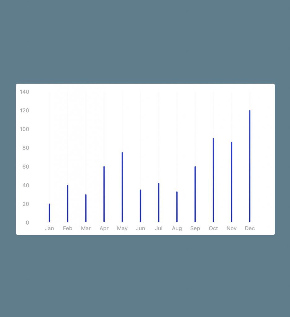
Yay! We’ve implemented the new chart by only changing 3 lines of code 😉
4. LineChart
Now we focus on the LineChart. It works pretty much like BarChart.
You need to add a LineChart widget in your Flutter app. Then you need to provide a LineChartData as a required argument.
LineChartData is like BarChartData. They both hold data about the representation. You can modify their properties to customize your chart.
Let’s check some LineChartData properties.
LineChartData has some properties just like BarChartData that we can completely reuse.
Like titlesData, maxY, gridData and borderData that we have used in our previous samples.
Now we can use lineBarsData property to provide our showing lines. We need to provide a list of LineChartBarData.(each of them represents an individual line).
For example in the sample that we are going to implement, there are two lines.
A red line and a blue line above it.
In each LineChartBarData, we can provide the spots, colors, barWidth, isCurved, …. properties.
To get started, let’s plot our first line (the blue one):
LineChart(
  LineChartData(
    lineBarsData: [
      LineChartBarData(
        spots: const [
          FlSpot(0, 24),
          FlSpot(1, 24),
          FlSpot(2, 40),
          FlSpot(3, 84),
          FlSpot(4, 100),
          FlSpot(5, 80),
          FlSpot(6, 64),
          FlSpot(7, 86),
          FlSpot(8, 108),
          FlSpot(9, 105),
          FlSpot(10, 105),
          FlSpot(11, 124),
        ],
      )
    ],
    titlesData: FlTitlesData(...),
    maxY: 140,
    gridData: FlGridData(show: false),
    borderData: FlBorderData(show: false),
  ),
),
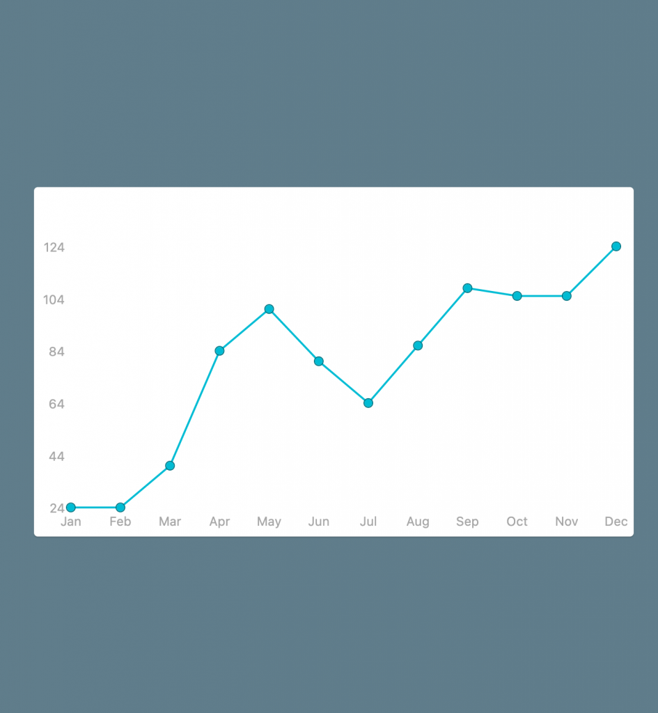
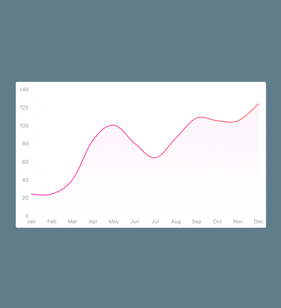
Not bad for the first try. But let’s improve it.
We used FlSpot(x, y) to plot our line chart (I have chosen the values with my eyes, they are not exactly like the design)
As you see left titles started from 24. That’s because we didn’t provide any minY value and it finds the minimum y value from your provided data.
To solve this issue, we need to provide minY: 0 in our LineChartData.
We also need to remove those circular points in the line.
To customize them we should modify dotData property of our LineChartBarData.
Let’s change the line’s color too (using colors property).
LineChart(
  LineChartData(
    lineBarsData: [
      LineChartBarData(
        spots: const [
          FlSpot(0, 24),
          FlSpot(1, 24),
          FlSpot(2, 40),
          FlSpot(3, 84),
          FlSpot(4, 100),
          FlSpot(5, 80),
          FlSpot(6, 64),
          FlSpot(7, 86),
          FlSpot(8, 108),
          FlSpot(9, 105),
          FlSpot(10, 105),
          FlSpot(11, 124),
        ],
        dotData: FlDotData(show: false),
        colors: const [Color(0xFFFF26B5), Color(0xFFFF5B5B)])
      )
    ],
    titlesData: FlTitlesData(
      rightTitles: SideTitles(showTitles: false),
      topTitles: SideTitles(showTitles: false),
      bottomTitles: SideTitles(
        reservedSize: 6,
        showTitles: true,
        getTitles: (xValue) {
          switch (xValue.toInt()) {
            case 0:
              return 'Jan';
            case 1:
              return 'Feb';
            case 2:
              return 'Mar';
            case 3:
              return 'Apr';
            case 4:
              return 'May';
            case 5:
              return 'Jun';
            case 6:
              return 'Jul';
            case 7:
              return 'Aug';
            case 8:
              return 'Sep';
            case 9:
              return 'Oct';
            case 10:
              return 'Nov';
            case 11:
              return 'Dec';
            default:
              throw StateError('Not supported');
          }
        },
      ),
      leftTitles: SideTitles(
        showTitles: true,
        interval: 20,
        reservedSize: 32,
      ),
    ),
    maxY: 140,
    minY: 0,
    gridData: FlGridData(show: false),
    borderData: FlBorderData(show: false),
  ),
)
Nice!
Note that we provided a list of colors to paint a gradient over our line. If you want to paint a solid color, you only need to provide one color.
At this point, I’m going to introduce a magic parameter. It’s isCurved: true.
It curves the line through the provided points.
child: LineChart(
  LineChartData(
    lineBarsData: [
      LineChartBarData(
        spots: const [ ... ],
        dotData: FlDotData(show: false),
        colors: const [Color(0xFFFF26B5), Color(0xFFFF5B5B)],
        isCurved: true,
      )
    ],
    titlesData: FlTitlesData(...),
    maxY: 140,
    minY: 0,
    gridData: FlGridData(show: false),
    borderData: FlBorderData(show: false),
  ),
)
There is also a curveSmoothness property that you can change the smoothness (0 is hard-edge and 0.35 is the default value).
As you see in the design, there is a highlight area at the bottom of our line.
Let’s implement it.
Each LineChartBarData has a belowBarData and aboveBarData properties which you can use them to customize the area above or below of the line.
Let’s customize belowBarData in our sample:
LineChartBarData(
  spots: const [
    FlSpot(0, 24),
    FlSpot(1, 24),
    FlSpot(2, 40),
    FlSpot(3, 84),
    FlSpot(4, 100),
    FlSpot(5, 80),
    FlSpot(6, 64),
    FlSpot(7, 86),
    FlSpot(8, 108),
    FlSpot(9, 105),
    FlSpot(10, 105),
    FlSpot(11, 124),
  ],
  dotData: FlDotData(show: false),
  colors: const [Color(0xFFFF26B5), Color(0xFFFF5B5B)],
  isCurved: true,
  belowBarData: BarAreaData(
    show: true,
  ),
)
As you see we only set show: true. It showed with a pre-defined values.
There is a colors property inside BarAreaData which you can use to customize the color.
If you pass one color, it paints a solid color, otherwise, it paints a gradient through your provided colors.
There is also gradientFrom, gradientTo, gradientColorStops properties which you can customize the gradient:
LineChartBarData(
  spots: const [
    FlSpot(0, 24),
    FlSpot(1, 24),
    FlSpot(2, 40),
    FlSpot(3, 84),
    FlSpot(4, 100),
    FlSpot(5, 80),
    FlSpot(6, 64),
    FlSpot(7, 86),
    FlSpot(8, 108),
    FlSpot(9, 105),
    FlSpot(10, 105),
    FlSpot(11, 124),
  ],
  dotData: FlDotData(show: false),
  colors: const [Color(0xFFFF26B5), Color(0xFFFF5B5B)],
  isCurved: true,
  belowBarData: BarAreaData(
    show: true,
    colors: const [Color(0x10FF26B5), Color(0x00FF26B5)],
    gradientFrom: const Offset(0.5, 0),
    gradientTo: const Offset(0.5, 1),
  ),
)
It seems fantastic 🤩 doesn’t it?
Now let’s add another LineChartBarData for the blue line.
Of course, we are going to duplicate it 🙂
child: LineChart(
  LineChartData(
    lineBarsData: [
      LineChartBarData(...),
      LineChartBarData(
        spots: const [
          FlSpot(0, 40),
          FlSpot(1, 28),
          FlSpot(2, 20),
          FlSpot(3, 18),
          FlSpot(4, 40),
          FlSpot(5, 92),
          FlSpot(6, 88),
          FlSpot(7, 70),
          FlSpot(8, 85),
          FlSpot(9, 102),
          FlSpot(10, 80),
          FlSpot(11, 80),
        ],
        dotData: FlDotData(show: false),
        colors: const [Color(0xFF268AFF), Color(0xFF905BFF)],
        isCurved: true,
        belowBarData: BarAreaData(
          show: true,
          colors: const [Color(0x1f268AFF), Color(0x00268AFF)],
          gradientFrom: const Offset(0.5, 0),
          gradientTo: const Offset(0.5, 1),
        ),
      ),
    ],
    titlesData: FlTitlesData(...),
    maxY: 140,
    minY: 0,
    gridData: FlGridData(show: false),
    borderData: FlBorderData(show: false),
  ),
),
Great! It’s time to implement the last line chart.
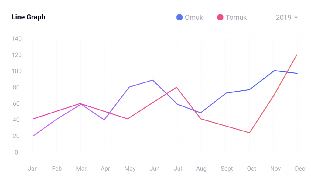
It’s pretty simple. We need something like the previous chart with isCurved: false.
child: LineChart(
  LineChartData(
    lineBarsData: [
      LineChartBarData(
        spots: const [ ... ],
        dotData: FlDotData(show: false),
        colors: const [Color(0xFFFF26B5), Color(0xFFFF5B5B)],
        isCurved: false,
        belowBarData: BarAreaData(
          show: true,
          colors: const [Color(0x10FF26B5), Color(0x00FF26B5)],
          gradientFrom: const Offset(0.5, 0),
          gradientTo: const Offset(0.5, 1),
        ),
      ),
      LineChartBarData(
        spots: const [ ... ],
        dotData: FlDotData(show: false),
        colors: const [Color(0xFF905BFF), Color(0xFF268AFF)],
        isCurved: false,
        belowBarData: BarAreaData(
          show: true,
          colors: const [Color(0x1f268AFF), Color(0x00268AFF)],
          gradientFrom: const Offset(0.5, 0),
          gradientTo: const Offset(0.5, 1),
        ),
      ),
    ],
    titlesData: FlTitlesData(...),
    maxY: 140,
    minY: 0,
    gridData: FlGridData(show: false),
    borderData: FlBorderData(show: false),
  ),
)
Congratulations 🥳
We Implemented all charts.
Now let’s put them in the boxes that we have made using GridView:
class HomePage extends StatelessWidget {
  const HomePage({Key? key}) : super(key: key);
  @override
  Widget build(BuildContext context) {
    return Scaffold(
      backgroundColor: const Color(0xFFE5E5E5),
      body: LayoutBuilder(
          builder: (context, constraints) {
            return GridView.count(
              crossAxisCount: constraints.maxWidth < 800 ? 1 : 2,
              childAspectRatio: 1.7,
              padding: const EdgeInsets.all(16),
              crossAxisSpacing: 16,
              mainAxisSpacing: 16,
              children: const [
                Card(child: BarChartWidget1()),
                Card(child: BarChartWidget2()),
                Card(child: LineChartWidget1()),
                Card(child: LineChartWidget2()),
              ],
            );
          }
      ),
    );
  }
}
Now we need to implement the top section of the charts (contains the legends).
5. Legends (top section)

To implement this, we need to use a Row widget to layout our widgets horizontally.
They don’t have any functionality at this time.
class TopSectionWidget extends StatelessWidget {
  final String title;
  final List<Legend> legends;
  final EdgeInsets padding;

  const TopSectionWidget({
    Key? key,
    required this.title,
    required this.legends,
    this.padding = EdgeInsets.zero,
  }) : super(key: key);

  @override
  Widget build(BuildContext context) {
    return Container(
      height: 20,
      margin: padding,
      child: Row(
        children: [
          Text(title, style: const TextStyle(color: Color(0xFF040420), fontWeight: FontWeight.bold, fontSize: 12)),
          Expanded(child: Container(), flex: 5),
          ...legends
              .map(
                (e) => Row(
                  children: [
                    _LegendWidget(legend: e),
                    const SizedBox(width: 12)
                  ],
                ),
              )
              .toList(),
          Expanded(child: Container(), flex: 1),
          const Text('2019', style: TextStyle(color: Color(0xFFA7A7B7))),
        ],
      ),
    );
  }
}

class _LegendWidget extends StatelessWidget {
  final Legend legend;

  const _LegendWidget({
    Key? key,
    required this.legend,
  }) : super(key: key);

  @override
  Widget build(BuildContext context) {
    return Row(
      children: [
        Container(
          width: 12,
          height: 12,
          decoration: BoxDecoration(
            color: legend.color,
            borderRadius: const BorderRadius.all(Radius.circular(4)),
          ),
        ),
        const SizedBox(width: 4),
        Text(legend.title, style: const TextStyle(color: Color(0xFFA7A7B7))),
      ],
    );
  }
}

class Legend {
  final String title;
  final Color color;

  Legend({
    required this.title,
    required this.color,
  });
}
6. Switch between dartk/light themes
As an advanced topic, Let’s implement dart/light temes with a Switch button.
You can read this article to understand how to switch between themes.
There is also an article about providers written by the Flutter team here.
We use ChangeNotifier and provider package to implement it.
fl_chart widgets are theme-aware. It means chart titles color, borders color, grid line colors,… change based on your current theme.
We are not going to explain how to switch between themes. Because it is not our main focus in this article.
BTW it’s simple, we provide a ChangeNotifier called MyThemeModel at top of the tree (above the MaterialApp). Then we use the Consumer widget of the provider package to rebuild our widget tree when the value (theme) is changed.
Then you can update your styles based on the current theme.
We can have access to the MyThemeModel using Provider.of(context, listen: false) and we call it’s switchTheme() when we want to change the theme.
class MyThemeModel extends ChangeNotifier {
  bool _isDark = false;

  ThemeMode currentTheme() {
    return _isDark ? ThemeMode.dark : ThemeMode.light;
  }

  bool isDark() {
    return currentTheme() == ThemeMode.dark;
  }

  void switchTheme() {
    _isDark = !_isDark;
    notifyListeners();
  }
}

void main() {
  // We provide it once at top of the tree
  runApp(
    ChangeNotifierProvider(
      create: (context) => MyThemeModel(),
      child: const MyApp(),
    ),
  );
}
class MyApp extends StatelessWidget {
  const MyApp({Key? key}) : super(key: key);

  @override
  Widget build(BuildContext context) {
    // We use it everywhere to update our widget three
    return Consumer<MyThemeModel>(
      builder: (context, themeModel, child) {
        return MaterialApp(
          title: 'Flutter4fun',
          debugShowCheckedModeBanner: false,
          theme: ThemeData.light(),
          darkTheme: ThemeData.dark(),
          themeMode: themeModel.currentTheme(),
          home: const HomePage(),
        );
      },
    );
  }
}
Thanks for reading this long article. Please let me know is it annoying to read this kind of long post or not? If it is annoying I can split them into a series of blog posts. (Like what we did in UI Challenge 2).
I built it using flutter web. Now you can try it out in your browser here.
Also, the source code is available here.
7. Buy me a coffe
If you like the fl_chart package, you can buy me a coffee to motivate me to work more on it 😝

Don’t forget to subscribe and write your feedback below.
Stay safe!
Wow what a nice design,
Thanks for sharing.
Thank you!
Read it and write your feedback.
I find it difficult to make the [ LineChart ] occupy the given space/given space by GridView.
It just centers itself not touching left or right.
In order to share images i will be creating an issue on GitHub, thanks
Would love to see how to make a range selector under line chart using fl_charts.
Similar to the graph for bitcoin price over time on coinmarketcap. https://coinmarketcap.com/currencies/bitcoin/?period=7d
You can file an issue (if there isn’t any opened already).
Go to the Github page.
WONDERFUL Post.thanks for share..extra wait .. …
Thanks for your support.