
Hi, there!
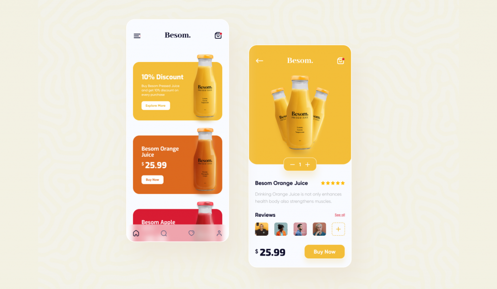
Today, we are going to implement Juice Product App by Arman Chowdhury Nijum.
I dropped the final result below to catch your eye (check the source code here).
If you’re ready, let’s get started!
It seems straightforward. BTW let’s break it into some small problems and then wrap them up.
1. Juice row item
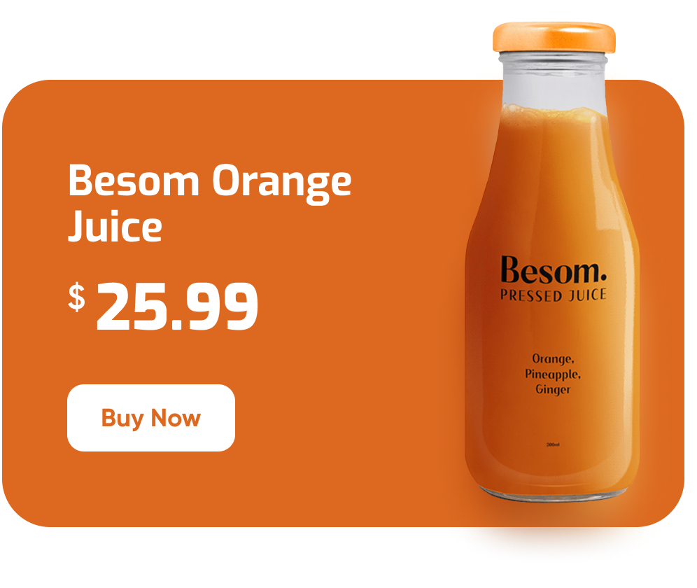
To implement this Item, we need a rounded rectangle behind the juice image on the right side.
You’re right, Stack is our solution to overlay widgets.
We also need to overlay some texts and a button on the left. To do that, we can combine a Row and a Column.
Okay, let’s create a rounded rectangle using the Container widget:
class MyHomePage extends StatelessWidget {
  @override
  Widget build(BuildContext context) {
    return Scaffold(
      appBar: AppBar(
        title: Text("flutter4fun.com"),
      ),
      body: Center(
        child: Padding(
          padding: const EdgeInsets.all(20.0),
          child: JuiceWidget(),
        ),
      ),
    );
  }
}

class JuiceWidget extends StatelessWidget {
  @override
  Widget build(BuildContext context) {
    return AspectRatio(
      aspectRatio: 1.25,
      child: Container(
        decoration: BoxDecoration(
          color: Color(0xFFDC691F),
          borderRadius: BorderRadius.circular(24)
        ),
      ),
    );
  }
}
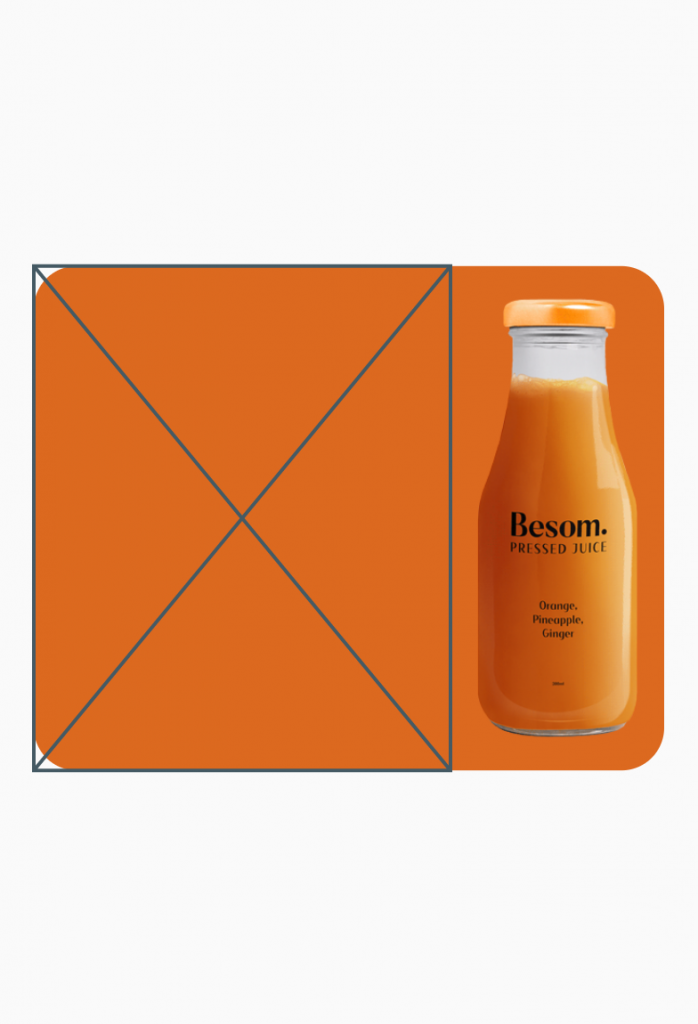
Now let’s put it in a stack and try to show a Row above it. Let’s focus on the right side to show the juice image. We use the PlaceHolder widget on the left side to fill it later.
class JuiceWidget extends StatelessWidget {
  @override
  Widget build(BuildContext context) {
    return AspectRatio(
      aspectRatio: 1.25,
      child: Stack(
        children: [
          Container(
            decoration: BoxDecoration(color: Color(0xFFDC691F), borderRadius: BorderRadius.circular(24)),
          ),
          Row(
            children: [
              Expanded(child: Placeholder()),
              SizedBox(
                width: 120,
                child: Image.network(
                  "https://flutter4fun.com/wp-content/uploads/2021/09/juice2.png",
                ),
              )
            ],
          )
        ],
      ),
    );
  }
}
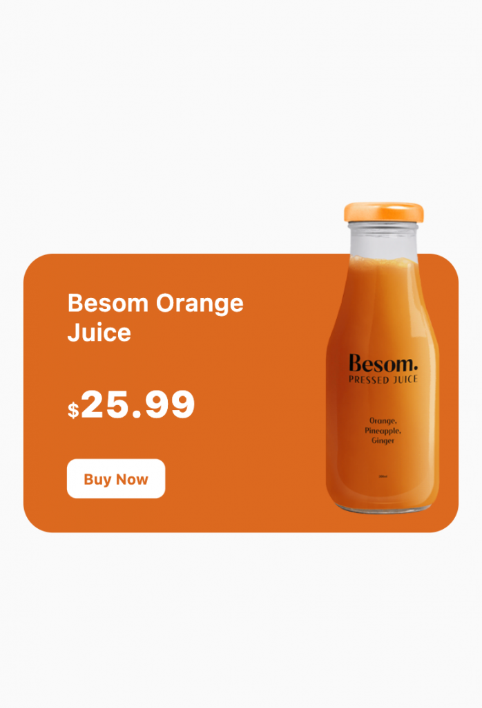
Ok, looks good. Now let’s add a little margin to the top of our Container and PlaceHolder.
To achieve a responsive layout, we need to wrap our Stack with a LayoutBuilder to access the width and height of our widget. Then we can calculate sizes/paddings based on the current size.
class JuiceWidget extends StatelessWidget {
  @override
  Widget build(BuildContext context) {
    return AspectRatio(
      aspectRatio: 1.25,
      child: LayoutBuilder(
        builder: (context, constraints) {
          final topPadding = constraints.maxHeight * 0.2;
          final imageWidth = constraints.maxWidth * 0.35;
          return Stack(
            children: [
              Container(
                margin: EdgeInsets.only(top: topPadding),
                decoration: BoxDecoration(color: Color(0xFFDC691F), borderRadius: BorderRadius.circular(24)),
              ),
              Row(
                children: [
                  Expanded(
                    child: Padding(
                      child: Placeholder(),
                      padding: EdgeInsets.only(
                        top: topPadding,
                      ),
                    ),
                  ),
                  SizedBox(
                    width: imageWidth,
                    child: Image.network(
                      "https://flutter4fun.com/wp-content/uploads/2021/09/juice2.png",
                    ),
                  )
                ],
              )
            ],
          );
        },
      ),
    );
  }
}
Now we are ready to replace our PlaceHolder with a Column. Then we can put needed Texts and Buttons inside it.
(Notice: MyButton is just a customized RaisedButton)
class JuiceWidget extends StatelessWidget {
  @override
  Widget build(BuildContext context) {
    final textStyle = TextStyle(
      color: Colors.white,
      fontSize: 16,
      fontWeight: FontWeight.w600,
    );
    return AspectRatio(
      aspectRatio: 1.25,
      child: LayoutBuilder(
        builder: (context, constraints) {
          final topPadding = constraints.maxHeight * 0.2;
          final leftPadding = constraints.maxWidth * 0.1;
          final imageWidth = constraints.maxWidth * 0.35;
          return Stack(
            children: [
              Container(
                margin: EdgeInsets.only(top: topPadding),
                decoration: BoxDecoration(color: Color(0xFFDC691F), borderRadius: BorderRadius.circular(24)),
              ),
              Row(
                children: [
                  Expanded(
                    child: Padding(
                      child: Column(
                        mainAxisAlignment: MainAxisAlignment.spaceEvenly,
                        mainAxisSize: MainAxisSize.max,
                        crossAxisAlignment: CrossAxisAlignment.start,
                        children: [
                          Text(
                            'Besom Orange Juice',
                            style: textStyle.copyWith(fontSize: 20),
                          ),
                          RichText(
                            text: TextSpan(
                              children: [
                                TextSpan(
                                  text: '\$',
                                  style: textStyle.copyWith(fontSize: 16),
                                ),
                                TextSpan(
                                  text: '25.99',
                                  style: textStyle.copyWith(
                                    fontSize: 30,
                                    fontWeight: FontWeight.w800,
                                  ),
                                ),
                              ],
                            ),
                          ),
                          SizedBox(
                            height: 32,
                            width: 80,
                            child: MyButton(
                              text: 'Buy Now',
                              textColor: Color(0xFFDC691F),
                            ),
                          ),
                        ],
                      ),
                      padding: EdgeInsets.only(
                        top: topPadding,
                        left: leftPadding,
                      ),
                    ),
                  ),
                  SizedBox(
                    width: imageWidth,
                    child: Image.network(
                      "https://flutter4fun.com/wp-content/uploads/2021/09/juice2.png",
                    ),
                  )
                ],
              )
            ],
          );
        },
      ),
    );
  }
}
Now we need to make our widget work with dynamic values. We need to pass name, image, color, … properties. Let’s create a class called JuiceEntity to hold these values and pass it to our widget. Then we can create a ListView to show different juices on our page.
class JuiceEntity {
  final String name;
  final String image;
  final String price;
  final Color color;

  JuiceEntity({
    required this.name,
    required this.image,
    required this.price,
    required this.color,
  });
}

final juiceList = [
  JuiceEntity(
    name: 'Besom Yellow Juice',
    image: 'https://flutter4fun.com/wp-content/uploads/2021/09/juice1.png',
    price: '19.99',
    color: Color(0xFFF3BE39),
  ),
  JuiceEntity(
    name: 'Besom Orange Juice',
    image: 'https://flutter4fun.com/wp-content/uploads/2021/09/juice2.png',
    price: '25.99',
    color: Color(0xFFDC691F),
  ),
];

class MyHomePage extends StatelessWidget {
  @override
  Widget build(BuildContext context) {
    return Scaffold(
      body: Center(
        child: ListView.builder(
          padding: EdgeInsets.all(20),
          itemBuilder: (context, index) {
            return JuiceWidget(juiceList[index]);
          },
          itemCount: juiceList.length,
        ),
      ),
    );
  }
}
Let’s move on to the next step!
2. Customized AppBar

This section has nothing special. We need a Row widget with mainAxisAlignment: MainAxisAlignment.spaceBetween.
class MyHomePage extends StatelessWidget {
  @override
  Widget build(BuildContext context) {
    return Scaffold(
      body: Column(
        children: [
          Container(
            height: 38,
            margin: EdgeInsets.only(left: 20, top: 32, right: 20, bottom: 8),
            child: Row(
              mainAxisAlignment: MainAxisAlignment.spaceBetween,
              children: [
                Image.network('https://flutter4fun.com/wp-content/uploads/2021/09/menu.png'),
                Text('Besom.', style: TextStyle(fontSize: 32, fontWeight: FontWeight.w800)),
                Image.network('https://flutter4fun.com/wp-content/uploads/2021/09/bag.png')
              ],
            ),
          ),
          Expanded(
            child: Center(
              child: ListView.builder(
                padding: EdgeInsets.all(20),
                itemBuilder: (context, index) {
                  return JuiceWidget(juiceList[index]);
                },
                itemCount: juiceList.length,
              ),
            ),
          )
        ],
      ),
    );
  }
}
3. Bottom Navigation Bar (Blurred)
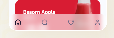
In this step, we are going to implement blurred bottom navigation.
First, we need to use a Row widget to show the icons.
Then we can use the BackdropFilter widget to make a blur effect.
We also need ClipRRect to make topLeft and topRight curve.
Stack(
  children: [
    BehindList(),
    Align(
      alignment: Alignment.bottomCenter,
      child: ClipRRect(
        borderRadius: BorderRadius.only(topLeft: Radius.circular(24), topRight: Radius.circular(24)),
        child: Container(
          color: Colors.white.withOpacity(0.2),
          height: 64,
          padding: EdgeInsets.symmetric(horizontal: 32, vertical: 12),
          child: BackdropFilter(
            filter: ImageFilter.blur(sigmaX: 18.0, sigmaY: 18.0),
            child: Row(
              mainAxisAlignment: MainAxisAlignment.spaceBetween,
              children: [
                Image.network('https://flutter4fun.com/wp-content/uploads/2021/09/Home.png'),
                Image.network('https://flutter4fun.com/wp-content/uploads/2021/09/Search.png'),
                Image.network('https://flutter4fun.com/wp-content/uploads/2021/09/Heart.png'),
                Image.network('https://flutter4fun.com/wp-content/uploads/2021/09/account.png'),
              ],
            ),
          ),
        ),
      ),
    )
  ],
),
Let’s move on to the second page (juice details)!
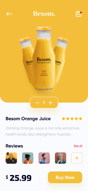
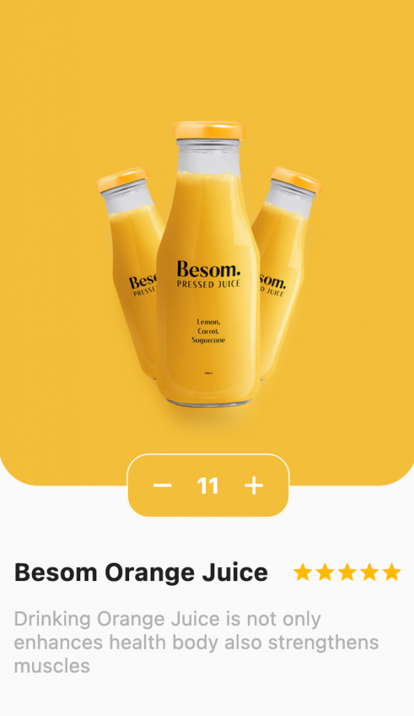
The top section contains a rounded rectangle and an image inside it. Below that, there is a counter widget. Users can increase or decrease the count before buying a juice.
Okay, first, let’s focus on the counter widget. Then we can implement the top section.
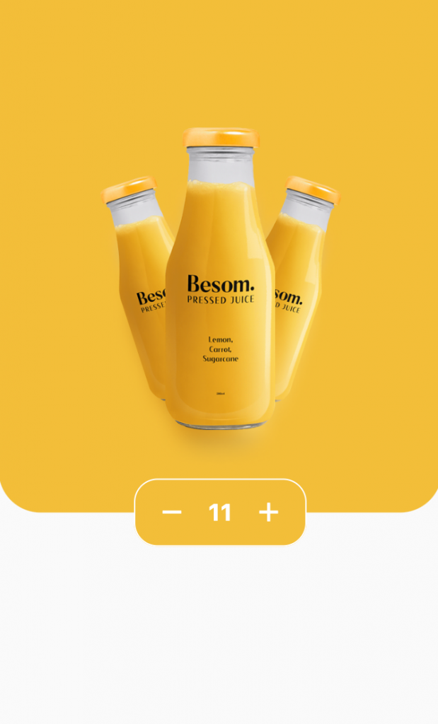
4. Counter Widget
The counter widget has nothing more than a Container and Row. We use Container to make a rounded rectangle and draw a white stroke line. Inside the Container, we use the Row widget to layout our items horizontally with this sequence.
[minusIcon, number, plusIcon].
@override
Widget build(BuildContext context) {
  return Container(
    height: 52,
    decoration: BoxDecoration(
      color: Color(0xFFF3BE39),
      borderRadius: BorderRadius.circular(18),
      border: Border.all(color: Colors.white),
    ),
    child: Row(
      mainAxisSize: MainAxisSize.min,
      children: [
        SizedBox(width: 16),
        Icon(Icons.remove, color: Colors.white),
        SizedBox(width: 10),
        Text('0', style: textStyle,),
        SizedBox(width: 10),
        Icon(Icons.add, color: Colors.white),
        SizedBox(width: 16),
      ],
    ),
  );
}
Now let’s implement the functionality. CounterWidget should get a currentCount property in its constructor (to show the current number). We also need to get onIncrease and onDecrease callbacks in the constructor and call them when the user clicks on the buttons.
class _JuiceDetailsPageState extends State<JuiceDetailsPage> {
  var count = 0;

  @override
  Widget build(BuildContext context) {
    return Scaffold(
      backgroundColor: Colors.grey,
      body: Center(
        child: CounterWidget(
          currentCount: count,
          color: widget.juice.color,
          onIncreaseClicked: () {
            setState(() {
              count++;
            });
          },
          onDecreaseClicked: () {
            setState(() {
              count--;
            });
          },
        ),
      ),
    );
  }
}

class CounterWidget extends StatelessWidget {
  final int currentCount;
  final Color color;
  final VoidCallback? onIncreaseClicked;
  final VoidCallback? onDecreaseClicked;
  final textStyle = TextStyle(color: Colors.white, fontWeight: FontWeight.w700, fontSize: 18);

  CounterWidget({
    required this.currentCount,
    required this.color,
    this.onIncreaseClicked,
    this.onDecreaseClicked,
  });

  @override
  Widget build(BuildContext context) {
    return Container(
      height: 52,
      decoration: BoxDecoration(
        color: color,
        borderRadius: BorderRadius.circular(18),
        border: Border.all(color: Colors.white),
      ),
      child: Row(
        mainAxisSize: MainAxisSize.min,
        children: [
          SizedBox(width: 16),
          GestureDetector(
            child: Icon(Icons.remove, color: Colors.white),
            onTap: onDecreaseClicked,
          ),
          SizedBox(width: 10),
          Text(
            currentCount.toString(),
            style: textStyle,
          ),
          SizedBox(width: 10),
          GestureDetector(
            child: Icon(Icons.add, color: Colors.white),
            onTap: onIncreaseClicked,
          ),
          SizedBox(width: 16),
        ],
      ),
    );
  }
}
As you may have noticed in the video, there is a minor problem.
When you change the number, widht of the widget changes as the number change. To solve this issue, we can wrap it with a SizedBox and provide a constant width: 30. We also need to set textAlign: TextAlign.center in the Text widget to show the number in the center.
@override
Widget build(BuildContext context) {
  return Container(
    height: 52,
    decoration: BoxDecoration(
      color: color,
      borderRadius: BorderRadius.circular(18),
      border: Border.all(color: Colors.white),
    ),
    child: Row(
      mainAxisSize: MainAxisSize.min,
      children: [
        SizedBox(width: 16),
        GestureDetector(
          child: Icon(Icons.remove, color: Colors.white),
          onTap: onDecreaseClicked,
        ),
        SizedBox(width: 10),
        SizedBox(
          width: 30,
          child: Text(
            currentCount.toString(),
            style: textStyle,
            textAlign: TextAlign.center,
          ),
        ),
        SizedBox(width: 10),
        GestureDetector(
          child: Icon(Icons.add, color: Colors.white),
          onTap: onIncreaseClicked,
        ),
        SizedBox(width: 16),
      ],
    ),
  );
}
5. Top section
We need a Container which has bottomLeft and bottomRight rounded corners.
Then we need to show an overlaid image at the bottom.
To be responsive, we use AspectRatio (to keep the ratio of design) and LayoutBuilder (to access the width and height of our widget).
@override
Widget build(BuildContext context) {
  return Scaffold(
    body: AspectRatio(
      child: LayoutBuilder(
        builder: (context, constraints) {
          final imageHeight = constraints.maxHeight * 0.7;
          final imageHorizontalMargin = constraints.maxWidth * 0.15;
          final imageBottomMargin = constraints.maxHeight * 0.07;
          return Container(
            decoration: BoxDecoration(
              color: widget.juice.color,
              borderRadius: BorderRadius.only(
                bottomLeft: Radius.circular(32),
                bottomRight: Radius.circular(32),
              ),
            ),
            child: Align(
              alignment: Alignment.bottomCenter,
              child: Padding(
                padding: EdgeInsets.only(
                  left: imageHorizontalMargin,
                  right: imageHorizontalMargin,
                  bottom: imageBottomMargin,
                ),
                child: Image.network(
                  'https://flutter4fun.com/wp-content/uploads/2021/09/full.png',
                  height: imageHeight,
                ),
              ),
            ),
          );
        },
      ),
      aspectRatio: 0.86,
    ),
  );
}
Great! Now let’s overlay our CounterWidget using Stack widget at the bottom center:
Stack(
  children: [
    Container(
      decoration: BoxDecoration(
        color: widget.juice.color,
        borderRadius: BorderRadius.only(
          bottomLeft: Radius.circular(32),
          bottomRight: Radius.circular(32),
        ),
      ),
      child: Align(
        alignment: Alignment.bottomCenter,
        child: Padding(
          padding: EdgeInsets.only(
            left: imageHorizontalMargin,
            right: imageHorizontalMargin,
            bottom: imageBottomMargin,
          ),
          child: Image.network(
            'https://flutter4fun.com/wp-content/uploads/2021/09/full.png',
            height: imageHeight,
          ),
        ),
      ),
    ),
    Align(
      alignment: Alignment.bottomCenter,
      child: CounterWidget(
        currentCount: count,
        color: widget.juice.color,
        onIncreaseClicked: () {
          setState(() {
            count++;
          });
        },
        onDecreaseClicked: () {
          setState(() {
            count--;
          });
        },
      ),
    )
  ],
);
Now counter widget should be out of the box area by half of its height. To achieve that, we can set the bottom margin of our Container.
Stack(
  children: [
    Container(
      decoration: BoxDecoration(
        color: widget.juice.color,
        borderRadius: BorderRadius.only(
          bottomLeft: Radius.circular(32),
          bottomRight: Radius.circular(32),
        ),
      ),
      child: Align(
        alignment: Alignment.bottomCenter,
        child: Padding(
          padding: EdgeInsets.only(
            left: imageHorizontalMargin,
            right: imageHorizontalMargin,
            bottom: imageBottomMargin,
          ),
          child: Image.network(
            'https://flutter4fun.com/wp-content/uploads/2021/09/full.png',
            height: imageHeight,
          ),
        ),
      ),
      margin: EdgeInsets.only(bottom: 26),
    ),
    Align(
      alignment: Alignment.bottomCenter,
      child: CounterWidget(
        currentCount: count,
        color: widget.juice.color,
        onIncreaseClicked: () {
          setState(() {
            count++;
          });
        },
        onDecreaseClicked: () {
          setState(() {
            count--;
          });
        },
      ),
    )
  ],
);
5. Page Content
Let’s implement this section. It seems easy!
We need to combine some Rows and Columns to achieve that. We also need to wrap all of them into a ListView to be scrollable. Let’s give it a try!
To implement the first row, we need to show a Text and a RatingBar. I searched for RatingBar, and it seems Flutter doesn’t have a built-in RatingBar widget. So we need to use a library. For the sake of simplicity, I just created a simple RatingBar to show only 5 stars (It doesn’t have any functionality).
And the second row is nothing more than a Text widget.
class SimpleRatingBar extends StatelessWidget {
  @override
  Widget build(BuildContext context) {
    return Row(
      children: List.generate(
        5,
        (index) => Icon(
          Icons.star,
          color: Color(0xFFFFBA00),
          size: 18,
        ),
      ),
    );
  }
}

ListView(
  children: [
    /* previously implemented widgets */,
    SizedBox(height: 58),
    Padding(
      padding: const EdgeInsets.symmetric(horizontal: 12.0),
      child: Column(
        children: [
          Row(
            children: [
              Text(
                'Besom Orange Juice',
                style: TextStyle(
                  fontSize: 20,
                  fontWeight: FontWeight.w700,
                ),
              ),
              SimpleRatingBar()
            ],
            mainAxisAlignment: MainAxisAlignment.spaceBetween,
            crossAxisAlignment: CrossAxisAlignment.center,
          ),
          SizedBox(height: 16),
          Text(
            'Drinking Orange Juice is not only enhances health body also strengthens muscles',
            style: TextStyle(color: Color(0xFFB0B1B4), fontSize: 16),
          ),
        ],
      ),
    )
  ],
),
In the reviews section, there are some rounded images. The last item contains a + sign and a dashed stroke around it. To implement that, we can use a CustomPainter to draw the dashed line. But here, we will use a simple image instead (we need to focus on other important topics).
We use ListView.separated to show our images with spaces between them. ListView.separated has a separatorBuilder callback to implement and show whatever you want between the items. (For example, you can show a separator or divider between your items). In our example, we only need a blank space between the items. To do that, we can use SizedBox to show a blank space.
class ReviewsList extends StatelessWidget {
  @override
  Widget build(BuildContext context) {
    return SizedBox(
      height: 48,
      child: ListView.separated(
        scrollDirection: Axis.horizontal,
        separatorBuilder: (_, index) => SizedBox(width: 18),
        itemBuilder: (_, index) {
          if (index == reviewImages.length) {
            return Image.network(addImageUrl);
          }

          return Image.network(reviewImages[index]);
        },
        itemCount: reviewImages.length + 1,
      ),
    );
  }
}

Column(
  children: [
    Row(
      mainAxisAlignment: MainAxisAlignment.spaceBetween,
      children: [
        /* previously implemented widgets */
        Text(
          'Reviews',
          style: TextStyle(
            fontSize: 20,
            fontWeight: FontWeight.w700,
          ),
        ),
        Text(
          'See all',
          style: TextStyle(
            color: Color(0xFFD81C33),
            decoration: TextDecoration.underline,
          ),
        )
      ],
    ),
    SizedBox(height: 16),
    ReviewsList(),
  ],
),
6. AppBar
We need to show AppBar on top of the screen. We must overlay it on top of our ListView to prevent it from being scrolled.
Let’s wrap our current ListView with a Stack and put our customized appBar above it.
To Implement our appBar’s design, we can use Container to apply padding and a Row to show icons and the text horizontally.
Stack(
  children: [
    /* ListView(...) ,*/
    Container(
      color: widget.juice.color,
      padding: EdgeInsets.only(left: 24, right: 24, top: 26, bottom: 8),
      child: Row(
        mainAxisAlignment: MainAxisAlignment.spaceBetween,
        children: [
          GestureDetector(
            child: Image.network(
              'https://flutter4fun.com/wp-content/uploads/2021/09/back.png',
              width: 32,
            ),
            onTap: () {
              Navigator.of(context).pop();
            },
          ),
          Text(
            'Besom.',
            style: TextStyle(
              fontSize: 26,
              fontWeight: FontWeight.w800,
              color: Colors.white,
            ),
          ),
          Image.network(
            'https://flutter4fun.com/wp-content/uploads/2021/09/shop_white.png',
            width: 32,
          )
        ],
      ),
    ),
  ],
)
7. Bottom Section

We also need to overlay this section above the ListView to prevent scrolling (just like what we did in the previous section).
We should put an extra space at the end of the ListView. Otherwise, the last items of our ListView will be hidden behind our Bottom Section.
Stack(
  children: [
    ListView(
      padding: EdgeInsets.only(bottom: bottomSectionHeight),
      children: [/* implemented widgets */]
    ),
    /* our AppBar */,
    Align(
      alignment: Alignment.bottomCenter,
      child: Container(
        height: bottomSectionHeight,
        color: Colors.white,
        padding: EdgeInsets.symmetric(horizontal: 12),
        child: Row(
          children: [
            Expanded(
              child: RichText(
                text: TextSpan(
                  style: TextStyle(color: Colors.black),
                  children: [
                    TextSpan(
                      text: '\$',
                      style: TextStyle(
                        fontSize: 20,
                        fontWeight: FontWeight.w600,
                      ),
                    ),
                    TextSpan(
                      text: '25.99',
                      style: TextStyle(
                        fontSize: 36,
                        fontWeight: FontWeight.w800,
                      ),
                    ),
                  ],
                ),
              ),
            ),
            SizedBox(
              width: 120,
              height: 48,
              child: MyButton(
                text: 'Buy Now',
                bgColor: Color(0xFFF3BE39),
                textColor: Colors.white,
              ),
            )
          ],
        ),
      ),
    )
  ],
),
Almost there! We have finished the details page. Now we need to open the details page when a user clicks on a juice item.
Below is the final result. Check source code here.
(Don’t forget to subscribe. Stay tuned for the next challenge!)