
Hi there. I hope you are doing well.
In the first part, we have implemented the bottom sheet section. Because I think that was the most challenging part.
Then I published it in the pub as a library. You can check it out here.
Now we can just import and use it in our UI implementation.
1. Scrollable section
Now we are going to focus on implementing the horizontal scrollable section:
Okay, let’s break it into two parts. In the first part, we will implement the horizontal list (doesn’t matter what we show) in this section we need a snapping physics to snap items at the left. Also, we need a scaling mechanism to scale up a little the most left item.
And in the second part, we will implement each individual item.
First Part:
The default ListView shows a vertical list. But in our case, we need a horizontal list. We can use ListView’s scrollDirection property to change its direction to horizontal. (we set scrollDirection : Axis.horizontal to do that).
import 'package:flutter/material.dart';

main() => runApp(MaterialApp(home: MyHomePage()));

class MyHomePage extends StatelessWidget {

  final itemWidth = 120.0;
  final itemHorizontalMargin = 4.0;

  @override
  Widget build(BuildContext context) {
    return Scaffold(
      appBar: AppBar(
        title: Text('Flutter 4 Fun'),
      ),
      body: Center(
        child: SizedBox(
          height: 200.0,
          child: ListView.builder(
            scrollDirection: Axis.horizontal,
            itemBuilder: (context, i) {
              return Container(
                width: itemWidth,
                height: 200,
                margin: EdgeInsets.symmetric(horizontal: itemHorizontalMargin),
                decoration: BoxDecoration(
                  color: Colors.purple,
                  borderRadius: BorderRadius.all(Radius.circular(4.0)),
                ),
                child: Center(
                  child: Text(
                    '$i',
                    style: TextStyle(
                      color: Colors.white,
                      fontWeight: FontWeight.bold,
                      fontSize: 22,
                    ),
                  ),
                ),
              );
            },
          ),
        ),
      ),
    );
  }
}
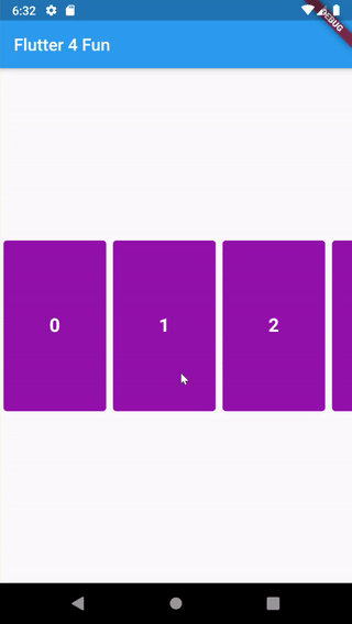
Okay now we are going to set a snapping physic to our list (because we want to snap items at the left of the screen)
We need to change the List’s physics property to do that.
I found a snippet code on the internet that we can copy-paste it and use it as SnappingListScrollPhysics.
@override
  Widget build(BuildContext context) {
    return Scaffold(
      appBar: AppBar(
        title: Text('Flutter 4 Fun'),
      ),
      body: Center(
        child: SizedBox(
          height: 200.0,
          child: ListView.builder(
            scrollDirection: Axis.horizontal,
            physics: SnappingListScrollPhysic(itemWidth: itemWidth + (itemHorizontalMargin * 2)),
            itemBuilder: (context, i) {
              return Container(
                width: itemWidth,
                height: 200,
                margin: EdgeInsets.symmetric(horizontal: itemHorizontalMargin),
                decoration: BoxDecoration(
                  color: Colors.purple,
                  borderRadius: BorderRadius.all(Radius.circular(4.0)),
                ),
                child: Center(
                  child: Text(
                    '$i',
                    style: TextStyle(
                      color: Colors.white,
                      fontWeight: FontWeight.bold,
                      fontSize: 22,
                    ),
                  ),
                ),
              );
            },
          ),
        ),
      ),
    );
  }
Okay, now every item snaps at the left of the screen. Now it’s time to make the left item bigger than others. We can do this by Transform.scale.
First, we need to put our list in a separate widget. We use StatefulWidget because we have to save some local states for scaling items.
Also, we can make our hardcoded-values dynamic by adding some constructor property. such as itemWidth, itemHorizontalMargin, listHeight.
Now our widget looks like this (we just moved our code here)
class HorizontalSnappingList extends StatefulWidget {
  final itemWidth;
  final itemHorizontalMargin;
  final listHeight;

  HorizontalSnappingList({
    this.itemWidth = 120.0,
    this.itemHorizontalMargin = 4.0,
    this.listHeight = 200.0,
  });

  @override
  _HorizontalSnappingListState createState() => _HorizontalSnappingListState();
}

class _HorizontalSnappingListState extends State<HorizontalSnappingList> {
  @override
  Widget build(BuildContext context) {
    return SizedBox(
      height: widget.listHeight,
      child: ListView.builder(
        scrollDirection: Axis.horizontal,
        physics: SnappingListScrollPhysic(
            itemWidth: widget.itemWidth + (widget.itemHorizontalMargin * 2)),
        itemBuilder: (context, i) {
          return Container(
            width: widget.itemWidth,
            height: widget.listHeight,
            margin: EdgeInsets.symmetric(horizontal: widget.itemHorizontalMargin),
            decoration: BoxDecoration(
              color: Colors.purple,
              borderRadius: BorderRadius.all(Radius.circular(4.0)),
            ),
            child: Center(
              child: Text(
                '$i',
                style: TextStyle(
                  color: Colors.white,
                  fontWeight: FontWeight.bold,
                  fontSize: 22,
                ),
              ),
            ),
          );
        },
      ),
    );
  }
}
Okay, now we can focus on scaling up and down items using their position.
For example, the most left item should be at scale 1.0. But others should be at 0.8. It makes the most left item bigger than others.
To do that, first, we need to listen to the list’s scroll. We should make a ScrollController and pass it to our List’s controller property. Then we must initialize, and listen to it in our initState() function.
Then we can access our controller.position.pixels to determine how much scroll is moved to the right. Using that we can find out which item is at the left of the screen now.
class _HorizontalSnappingListState extends State<HorizontalSnappingList> {

  ScrollController _scrollController;
  double scrollOffset = 0;

  @override
  void initState() {
    _scrollController = new ScrollController();
    _scrollController.addListener(() {
      setState(() {
        scrollOffset = _scrollController.position.pixels / widget.itemsConsumedWidth;
      });
    });
    super.initState();
  }

  @override
  Widget build(BuildContext context) {
    return SizedBox(
      ...,
      child: ListView.builder(
        controller: _scrollController,
        ...
      ),
    );
  }
}
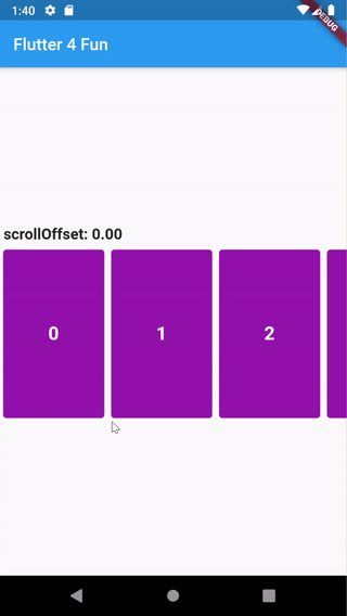
Fair enough, now you understand how scrollOffset works. It tells us which item is at the left of the screen with what offset.
Now we can convert this offset to a scale number between 0.8 to 1.0.
If an item is exactly at the left of the screen it should be 1.0. And depends on how much it is far from the left of the screen (we can find it using offset) it should be scaled down.
And other far items should be scaled down in constant 0.8.
I used this formula to get each item’s scale using the scrollOffset variable:
(i is the index of the current item, which come from itemBuilder as a parameter)
double scale = ((1 - math.min((i - scrollOffset).abs(), 1.0)) * (1 - 0.8)) + 0.8;You may find another way to calculate it, but it works fine to me.
@override
  Widget build(BuildContext context) {
    return SizedBox(
      height: widget.listHeight,
      child: ListView.builder(
        itemBuilder: (context, i) {
          double scale = ((1 - math.min((i - scrollOffset).abs(), 1.0)) * (1 - 0.8)) + 0.8;
          return Transform.scale(
            scale: scale,
            child: Item(i, scale),
          );
        },
      ),
    );
  }
Okay, it’s pretty much done. We just need to clean up our code. And make it ready for our usage. Even we can publish it as a library.
2. List items
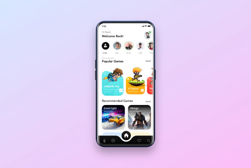
In this section we are going to implement each list item, something like the below image:
First, we need to draw a shape like the below image. We can use the CustomPaint widget to do that. But also we can get a ready image from our designer too. We will use an image to do that simpler, but drawing it is more efficient I think. We just need to have a white version of it to tint it with a custom color.
For example this is white version of this shape:
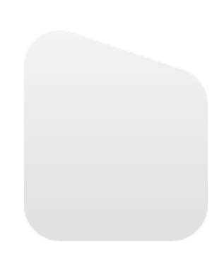
We can load it by an Image widget and set a color for it.
import 'package:flutter/material.dart';

main() => runApp(MaterialApp(home: MyHomePage()));

final double itemWidth = 140.0;
final double itemHeight = 200.0;
final double horizontalItemMargin = 4.0;

class MyHomePage extends StatelessWidget {
  @override
  Widget build(BuildContext context) {
    return Scaffold(
      backgroundColor: Colors.white,
      appBar: AppBar(
        title: Text('Flutter 4 Fun'),
      ),
      body: Center(
        child: PlayerItem(),
      ),
    );
  }
}

class PlayerItem extends StatelessWidget {
  @override
  Widget build(BuildContext context) {
    return Container(
      width: itemWidth,
      height: itemHeight,
      child: Image.network(
        'https://img.techpowerup.org/201025/items-bg.png',
        color: Colors.cyan,
      ),
    );
  }
}
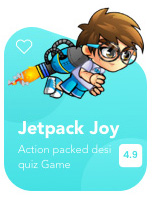
Now we can overlap another Image and some Texts to achieve the below sample:
I have made it by combining Stack, Column, Row:
Container(
      width: itemWidth,
      height: itemHeight,
      child: Stack(
        children: [
          Align(
            alignment: Alignment.bottomCenter,
            child: Image.network(
              'https://img.techpowerup.org/201025/items-bg.png',
              color: bgColor,
            ),
          ),
          Align(
            alignment: Alignment.topLeft,
            child: Padding(
              padding: const EdgeInsets.only(top: 46.0, left: 10),
              child: Icon(
                Icons.favorite_outline,
                color: Colors.white,
              ),
            ),
          ),
          Column(
            mainAxisSize: MainAxisSize.max,
            crossAxisAlignment: CrossAxisAlignment.end,
            children: [
              SizedBox(
                height: 18,
              ),
              Image.network(
                image,
                width: itemWidth * 0.85,
              ),
              SizedBox(
                height: 18,
              ),
              Column(
                mainAxisSize: MainAxisSize.max,
                crossAxisAlignment: CrossAxisAlignment.start,
                children: [
                  Padding(
                    padding: const EdgeInsets.only(left: 8.0),
                    child: Text(
                      name,
                      style: TextStyle(
                        color: Colors.white,
                        fontSize: 18,
                      ),
                    ),
                  ),
                  SizedBox(
                    height: 6,
                  ),
                  Row(
                    mainAxisSize: MainAxisSize.max,
                    children: [
                      Expanded(
                        child: Padding(
                          padding: const EdgeInsets.only(left: 8.0),
                          child: Text(
                            description,
                            style: TextStyle(
                              color: Colors.white,
                              fontSize: 12,
                            ),
                          ),
                        ),
                      ),
                      Container(
                        width: 24,
                        height: 24,
                        margin: EdgeInsets.only(right: 8, left: 8),
                        decoration: BoxDecoration(
                            color: Colors.white,
                            borderRadius: BorderRadius.all(Radius.circular(5))),
                        child: Center(
                          child: Text(
                            '4.9',
                            style: TextStyle(
                                color: bgColor, fontWeight: FontWeight.bold, fontSize: 12),
                          ),
                        ),
                      )
                    ],
                  )
                ],
              )
            ],
          )
        ],
      ),
    )
I think we don’t need to explain it because we simply combined some basic widgets. BTW If you think it is complicated let me know. I will add more explanations.
Now let’s make a list of this item by providing some mocked data and see the result:
class PlayerModel {
  final Color bgColor;
  final String image, name, description;
  final bool isFavorite;
  final double rank;
  final double imageScale;

  PlayerModel({
    @required this.bgColor,
    @required this.image,
    @required this.name,
    @required this.description,
    @required this.isFavorite,
    @required this.rank,
    this.imageScale = 1.0,
  });
}
...
@override
Widget build(BuildContext context) {
  final player1 = PlayerModel(
    bgColor: Color(0xFF7AF2F3),
    image: 'https://img.techpowerup.org/201025/player1.png',
    name: 'Jetpack Joy',
    description: 'Action packed desi quiz Game',
    isFavorite: false,
    rank: 4.9,
  );

  final player2 = PlayerModel(
    bgColor: Color(0xFFFFC300),
    image: 'https://img.techpowerup.org/201026/player2.png',
    name: 'X Fighter',
    description: 'Battle Royale',
    isFavorite: true,
    rank: 4.6,
    imageScale: 1.5,
  );

  final player3 = PlayerModel(
    bgColor: Color(0xFFFF6D62),
    image: 'https://img.techpowerup.org/201026/player3.png',
    name: 'Ninja Race',
    description: 'Real time racing',
    isFavorite: false,
    rank: 4.0,
  );

  List<PlayerModel> players = [
    player1,
    player2,
    player3,
    player1,
    player2,
    player3,
    player1,
    player2,
    player3,
  ];

  return Scaffold(
    appBar: AppBar(
      title: Text('Flutter 4 Fun'),
    ),
    body: Center(
      child: HorizontalSnappingList(
        itemWidth: 120,
        itemHorizontalMargin: horizontalItemMargin,
        itemCount: players.length,
        itemBuilder: (context, i) => PlayerItemWidget(playerModel: players[i]),
        ),
      ),
    );
  }
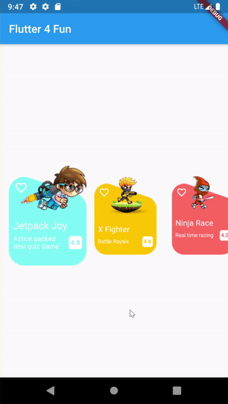
Here you go. That seems beautiful 🙂
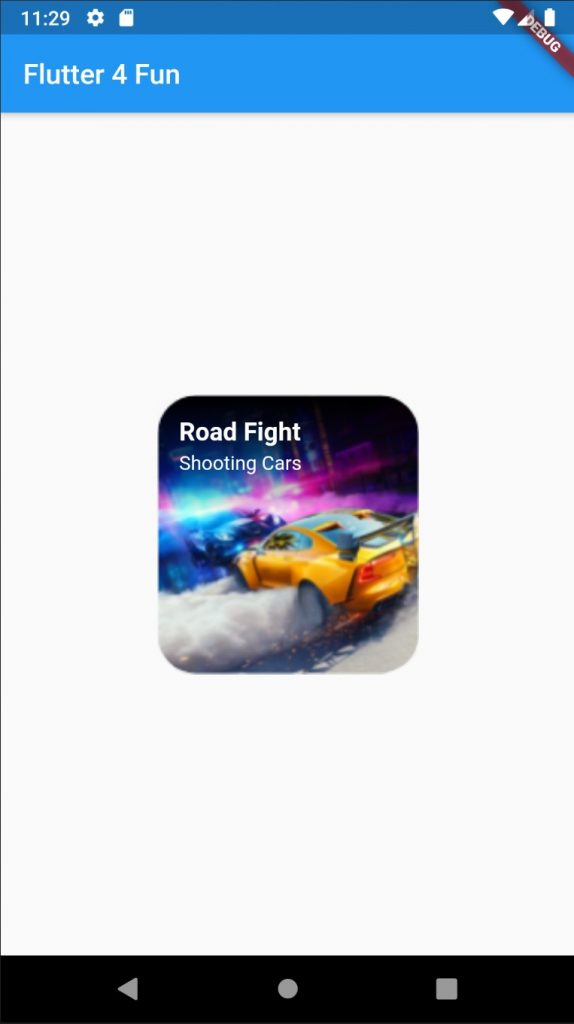
Now we are going to implement the second item type. Something like below Image:
We can simply put an Image in a Stack as a background image. Then it’s time to put some texts over it to achieve that.
final double itemWidth = 188.0;
final double itemHeight = 200.0;

Container(
  width: itemWidth,
  height: itemHeight,
  child: Stack(
    fit: StackFit.expand,
    children: [
      Image.network(
        'https://img.techpowerup.org/201029/game1.png',
        fit: BoxFit.fitHeight,
      ),
      Padding(
        padding: const EdgeInsets.all(16.0),
        child: Column(
          crossAxisAlignment: CrossAxisAlignment.start,
          children: [
            Text(
              'Road Fight',
              style: TextStyle(
                color: Colors.white,
                fontWeight: FontWeight.bold,
                fontSize: 18,
              ),
            ),
            SizedBox(height: 4,),
            Text(
              'Shooting Cars',
              style: TextStyle(
                color: Colors.white,
                fontSize: 14,
              ),
            ),
          ],
        ),
      )
    ],
  ),
);
As I think this is simpler than previous we are not going to explain it deeply. BTW if you think we need to go deeper about it please let me know in the comments or anywhere you can find me.
Here is the output list:
class GameModel {
  final String image;
  final String title;
  final String subtitle;

  GameModel({
    this.image,
    this.title,
    this.subtitle,
  });
}

final game1 = GameModel(
  image: 'https://img.techpowerup.org/201029/game1.png',
  title: 'Road Fight',
  subtitle: 'Shooting Cars',
);

final game2 = GameModel(
  image: 'https://img.techpowerup.org/201029/game2.png',
  title: 'Vikings',
  subtitle: 'Sons of Ragnar',
);

final List<GameModel> games = [
  game1,
  game2,
  game1,
  game2,
  game1,
  game2,
  game1,
  game2,
  game1,
  game2,
  game1,
  game2,
  game1,
  game2,
  game1,
  game2,
];

class MyHomePage extends StatelessWidget {

  @override
  Widget build(BuildContext context) {
    return Scaffold(
      appBar: AppBar(
        title: Text('Flutter 4 Fun'),
      ),
      body: Center(
        child: HorizontalSnappingList(
          itemWidth: 188.0,
          itemHorizontalMargin: 0,
          itemCount: games.length,
          itemBuilder: (context, i) => GameItemWidget(gameModel: games[i]),
        ),
      ),
    );
  }
}
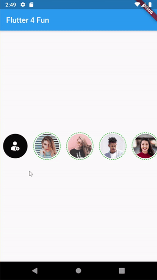
3. Stories section
This is our final section and after that, we are going to wrap them up.
In this section, we are going to implement the stories section.
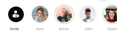
There are some circle images. With some dotted are around them.
I have found a library called dashed_circle. That is exactly what we want.
We are going to use it to speed up our process.
Center(
  child: DashedCircle(
    child: Padding(
      padding: EdgeInsets.all(5.0),
      child: CircleAvatar(
        radius: 60.0,
        backgroundColor: Colors.grey,
        backgroundImage: NetworkImage("https://img.techpowerup.org/201029/user2.png"),
      ),
    ),
    dashes: 20,
    gapSize: 4,
    color: Colors.green,
  ),
)
There is a bug within this library. strokeWidth property doesn’t work. So I just copied the library’s codes. Then I made a minor change to fix that issue (here is the updated code).
Also, I have opened a merge request to fix this in the library too.
Below is final output:
class UserStoryWidget extends StatelessWidget {
  final String url;

  const UserStoryWidget(this.url);

  @override
  Widget build(BuildContext context) {
    return DashedCircle(
      child: Padding(
        padding: EdgeInsets.all(3.0),
        child: CircleAvatar(
          radius: storyRadius,
          backgroundColor: Colors.grey,
          backgroundImage: NetworkImage(url),
        ),
      ),
      dashes: 40,
      gapSize: 2,
      strokeWidth: 2.0,
      color: Colors.green,
    );
  }
}

List<String> users = [
  "https://img.techpowerup.org/201029/user1.png",
  "https://img.techpowerup.org/201029/user2.png",
  "https://img.techpowerup.org/201029/user3.png",
  "https://img.techpowerup.org/201029/user4.png",
  "https://img.techpowerup.org/201029/user1.png",
  "https://img.techpowerup.org/201029/user2.png",
  "https://img.techpowerup.org/201029/user3.png",
  "https://img.techpowerup.org/201029/user4.png",
];

class StoriesSection extends StatelessWidget {
  @override
  Widget build(BuildContext context) {
    return Container(
      height: 80,
      child: ListView.builder(
        itemCount: users.length + 1,
        scrollDirection: Axis.horizontal,
        itemBuilder: (context, i) {
          Widget widget;
          if (i == 0) {
            widget = Container(
              width: storyRadius * 2,
              height: storyRadius * 2,
              padding: EdgeInsets.all(20),
              decoration: BoxDecoration(
                shape: BoxShape.circle,
                color: Color(0xFF0B0A0A),
              ),
              child: Image.network('https://img.techpowerup.org/201029/addstory.png'),
            );
          } else {
            widget = UserStoryWidget(users[i - 1]);
          }

          return Padding(
            padding: EdgeInsets.symmetric(horizontal: 8),
            child: Center(child: widget),
          );
        },
      ),
    );
  }
}

class MyHomePage extends StatelessWidget {
  @override
  Widget build(BuildContext context) {
    return Scaffold(
      appBar: AppBar(
        title: Text('Flutter 4 Fun'),
      ),
      body: Center(child: StoriesSection()),
    );
  }
}
4. Wrap up
It’s time to wrap up our widgets. And try to make the final result.
I will do this without explaining. Because there is nothing important or challenging to explain.
If you need more explanation please let me know to change my approach.
I have combined the implemented sections together, and you can find the complete code here on Github.
Stay tuned for the next challenge 🙂
[…] Check out the 2nd part here. […]
another SnappingListScrollPhysics link: https://gist.github.com/nxcco/98fca4a7dbdecf2f423013cf55230dba
Thank you!
My mistake. I didn’t know it was 100% the same snippet code.