
Hi folks.
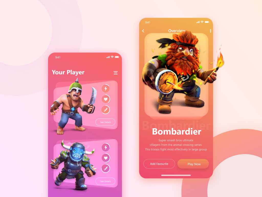
In this post, we are going to implement Game App UI by Tanmoy Roy (check it in the Uplabs).
Let’s jump into implementation. As you may know, we have to split it into smaller problems and then we are going to implement them.
1. Item row section
I think the most important part is the item’s row section.
To Implement this section, we should use a Stack widget to overlay our views.
Firstly we should make the background section, we can use Container and Transform to implement it.
Here we rotate our Container around the y-axis. You can read more about transform here.
Transform(
  alignment: FractionalOffset.center,
  transform: Matrix4.identity()
    ..setEntry(3, 2, 0.01)
    ..rotateY(radians(rotationY)), // degrees from slider
  child: Container(
    height: 180,
    color: Colors.white.withOpacity(0.4),
    margin: EdgeInsets.symmetric(horizontal: 40),
  ),
),
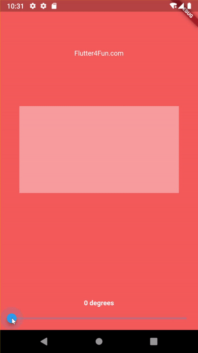
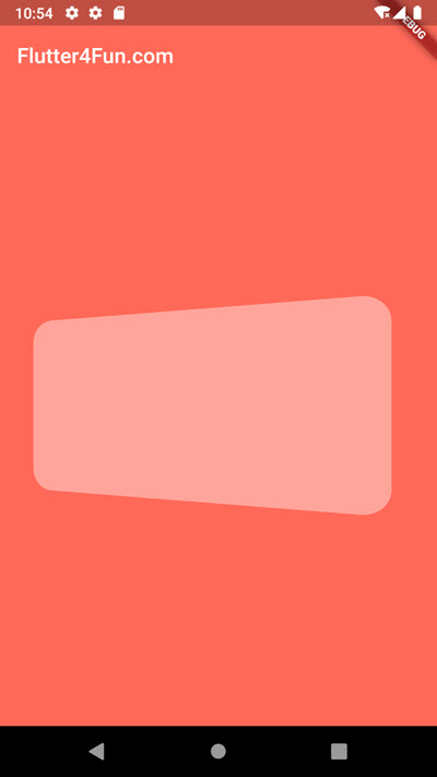
Now we can find an appropriate number. for example I think 5 degrees is enough.
Okay. As you see there is a minor problem. Our shape is not centered anymore.
We need to wrap it by another Transform to translate it to the left.
And also we can implement rounded corners.
Transform.translate(
  offset: Offset(-30, 0),
  child: Transform(
    alignment: FractionalOffset.center,
    transform: Matrix4.identity()
      ..setEntry(3, 2, 0.01)
      ..rotateY(radians(5)),
    child: Container(
      height: 180,
      margin: EdgeInsets.symmetric(horizontal: 40),
      decoration: BoxDecoration(
        color: Colors.white.withOpacity(0.4),
        borderRadius: BorderRadius.all(Radius.circular(22)),
      ),
    ),
  ),
),
(Keep in mind that we didn’t optimize it for all screens, we just hard-coded some values. You may face some problems with bigger screens.)
Okay, now let’s add another Container below it:
Stack(
  alignment: Alignment.center,
  children: [
    Transform.translate(
      offset: Offset(-10, 0),
      child: Transform(
        alignment: FractionalOffset.center,
        transform: Matrix4.identity()
          ..setEntry(3, 2, 0.01)
          ..rotateY(radians(1.5)),
        child: Container(
          height: 216,
          margin: EdgeInsets.symmetric(horizontal: 40),
          decoration: BoxDecoration(
            color: Colors.white.withOpacity(0.1),
            borderRadius: BorderRadius.all(Radius.circular(22)),
          ),
        ),
      ),
    ),
    Transform.translate(
      offset: Offset(-44, 0),
      child: Transform(
        alignment: FractionalOffset.center,
        transform: Matrix4.identity()
          ..setEntry(3, 2, 0.01)
          ..rotateY(radians(8)),
        child: Container(
          height: 188,
          margin: EdgeInsets.symmetric(horizontal: 40),
          decoration: BoxDecoration(
            color: Colors.white.withOpacity(0.4),
            borderRadius: BorderRadius.all(Radius.circular(22)),
          ),
        ),
      ),
    ),
  ],
),
Great! Now it’s time to put our hero character image:
Container(
  height: rowHeight,
  child: Stack(
    alignment: Alignment.center,
    children: [
      Transform.translate(
        offset: Offset(-10, 0),
        child: Transform(
          alignment: FractionalOffset.center,
          transform: Matrix4.identity()
            ..setEntry(3, 2, 0.01)
            ..rotateY(radians(1.5)),
          child: Container(
            height: 216,
            margin: EdgeInsets.symmetric(horizontal: 40),
            decoration: BoxDecoration(
              color: Colors.white.withOpacity(0.1),
              borderRadius: BorderRadius.all(Radius.circular(22)),
            ),
          ),
        ),
      ),
      Transform.translate(
        offset: Offset(-44, 0),
        child: Transform(
          alignment: FractionalOffset.center,
          transform: Matrix4.identity()
            ..setEntry(3, 2, 0.01)
            ..rotateY(radians(8)),
          child: Container(
            height: 188,
            margin: EdgeInsets.symmetric(horizontal: 40),
            decoration: BoxDecoration(
              color: Colors.white.withOpacity(0.4),
              borderRadius: BorderRadius.all(Radius.circular(22)),
            ),
          ),
        ),
      ),
      Align(
        alignment: Alignment.centerLeft,
        child: Transform.translate(
          offset: Offset(-30, 0),
          child: Container(
            child: Image.network(
              'https://flutter4fun.com/wp-content/uploads/2020/11/Player-1.png',
              width: rowHeight,
              height: rowHeight,
            ),
          ),
        ),
      ),
    ],
  ),
);
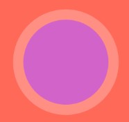
Awesome! now we are going to implement the attributes section (those circles at the right of the character)

To do that we can use CustomPaint widget.
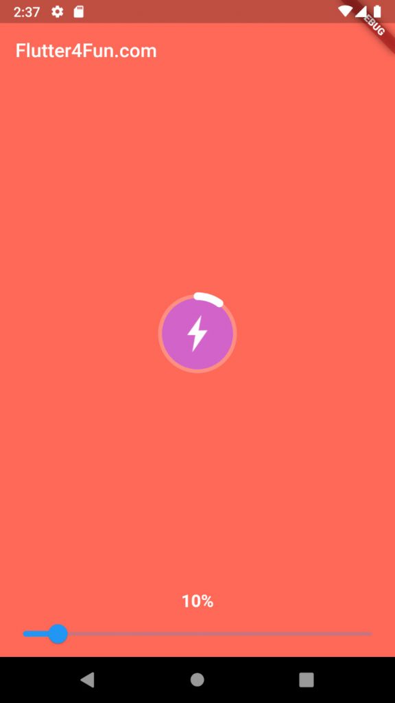
We use canvas.drawCircle twice (first for a large circle, second for an inner circle) after that we have something like this:
Then we paint the progress bar using canvas.drawArc:
class AttributePainter extends CustomPainter {
  final double progressPercent;
  final double strokeWidth, filledStrokeWidth;

  final bgPaint, strokeBgPaint, strokeFilledPaint;

  AttributePainter({
    this.progressPercent,
    this.strokeWidth = 4.0,
    this.filledStrokeWidth = 8.0,
  })  : bgPaint = Paint()..color = Colors.white.withOpacity(0.25),
        strokeBgPaint = Paint()..color = Color(0xffD264C9),
        strokeFilledPaint = Paint()
          ..color = Colors.white
          ..style = PaintingStyle.stroke
          ..strokeWidth = filledStrokeWidth
          ..strokeCap = StrokeCap.round;

  @override
  void paint(Canvas canvas, Size size) {
    final center = Offset(size.width / 2, size.height / 2);
    final radius = size.width / 2;

    canvas.drawCircle(center, radius, bgPaint);
    canvas.drawCircle(center, radius - strokeWidth, strokeBgPaint);
    canvas.drawArc(
      Rect.fromCircle(center: center, radius: radius - (strokeWidth / 2)),
      -math.pi / 2, // - 45 degrees to start from top
      (progressPercent / 100) * math.pi * 2,
      false,
      strokeFilledPaint,
    );
  }

  @override
  bool shouldRepaint(covariant CustomPainter oldDelegate) => true;
}
Okay, now we just need to put our image at the middle of our CustomPaint widget. Fortunately, CustomPaint widget has a child property. It puts the child property at the center of itself.
AttributeWidget(
  progress: progress,
  child: Image.network('https://flutter4fun.com/wp-content/uploads/2020/11/speed.png'),
)

class AttributeWidget extends StatelessWidget {
  final double size;
  final double progress;
  final Widget child;

  const AttributeWidget({
    Key key,
    @required this.progress,
    this.size = 82,
    this.child,
  }) : super(key: key);

  @override
  Widget build(BuildContext context) {
    return CustomPaint(
      painter: AttributePainter(
        progressPercent: progress,
      ),
      size: Size(size, size),
      child: Container(
        padding: EdgeInsets.all(size / 3.8),
        width: size,
        height: size,
        child: child,
      ),
    );
  }
}
Fair enough, let’s back to the hero row widget. Now we can put attributes at the right of our character image. Then we use OutlineButton for the “see details” button:
Align(
  alignment: Alignment.centerRight,
  child: Container(
    margin: EdgeInsets.only(right: 58),
    padding: EdgeInsets.symmetric(vertical: 34),
    child: Column(
      mainAxisAlignment: MainAxisAlignment.spaceAround,
      children: [
        AttributeWidget(
          progress: hero.speed,
          child: Image.network(speed),
        ),
        AttributeWidget(
          progress: hero.health,
          child: Image.network(heart),
        ),
        AttributeWidget(
          progress: hero.attack,
          child: Image.network(knife),
        ),
        SizedBox(
          height: 32,
          child: OutlineButton(
            child: new Text(
              'See Details',
              style: TextStyle(
                color: Colors.white,
                fontSize: 12,
              ),
            ),
            onPressed: () {},
            color: Colors.white,
            borderSide: BorderSide(
              color: Colors.white,
              width: 1,
            ),
            highlightedBorderColor: Colors.white,
            shape: RoundedRectangleBorder(
              borderRadius: new BorderRadius.circular(30.0),
            ),
          ),
        )
      ],
    ),
  ),
)
Yay, we did it. now we can have a list to complete the first page.
Also, we need a gradient background, we can use Container and BoxDecoration to implement LinearGradient.
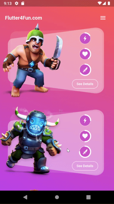
So this is the result of the first part.
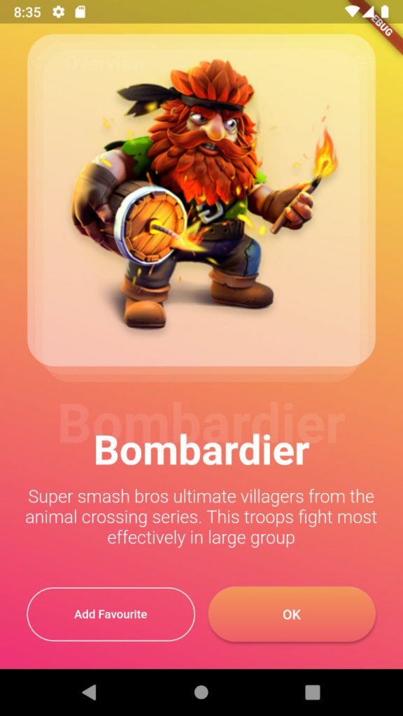
2. Item details
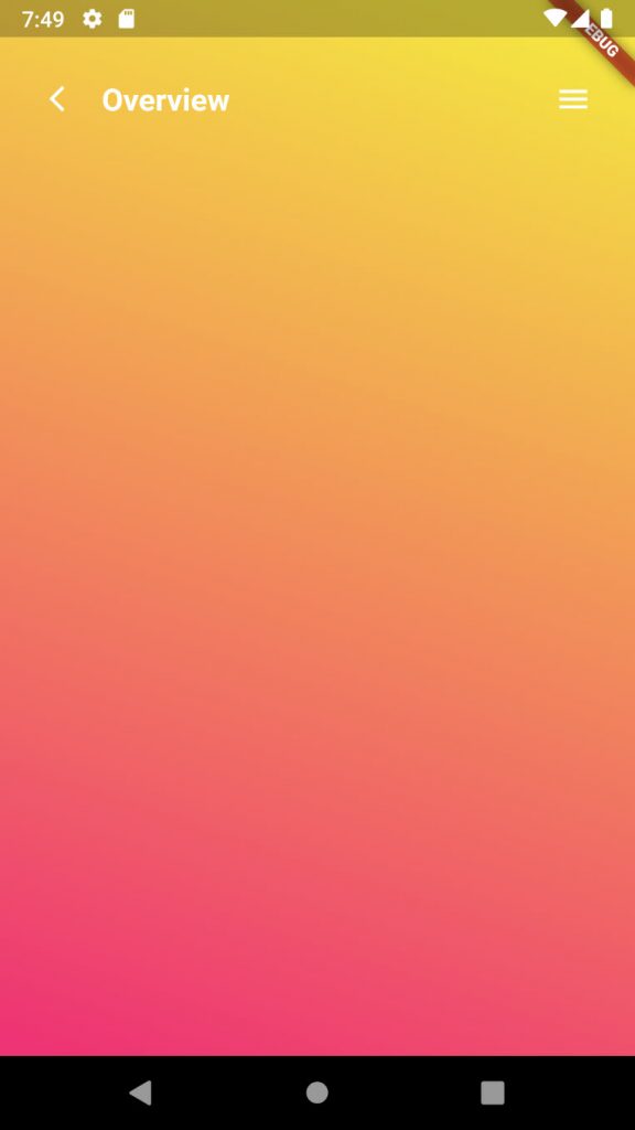
In this part we are going to implement the details screen, see below image:
Before everything, we already know how to implement the gradient and the toolbar section. I will implement them without any explanation.
Scaffold(
  body: Container(
    width: double.infinity,
    height: double.infinity,
    child: Stack(
      children: [
        SafeArea(
          child: Row(
            crossAxisAlignment: CrossAxisAlignment.center,
            children: [
              SizedBox(
                width: 18,
              ),
              IconButton(
                icon: Icon(
                  Icons.arrow_back_ios,
                  color: Colors.white,
                  size: 20,
                ),
                onPressed: () {
                  Navigator.of(context).pop();
                },
              ),
              Text(
                'Overview',
                style: TextStyle(
                  color: Colors.white,
                  fontSize: 20,
                  fontWeight: FontWeight.bold,
                ),
              ),
              Expanded(
                  child: Container(
                height: 80,
              )),
              Container(
                width: 80,
                height: 80,
                child: Icon(
                  Icons.menu,
                  color: Colors.white,
                ),
              )
            ],
          ),
        ),
        // _HeroDetailsImage(hero.image),
      ],
    ),
    decoration: BoxDecoration(
      gradient: LinearGradient(
        colors: [
          Color(0xFFF4E342),
          Color(0xFFEE3474),
        ],
        begin: Alignment(0.3, -1),
        end: Alignment(-0.8, 1),
      ),
    ),
  ),
);
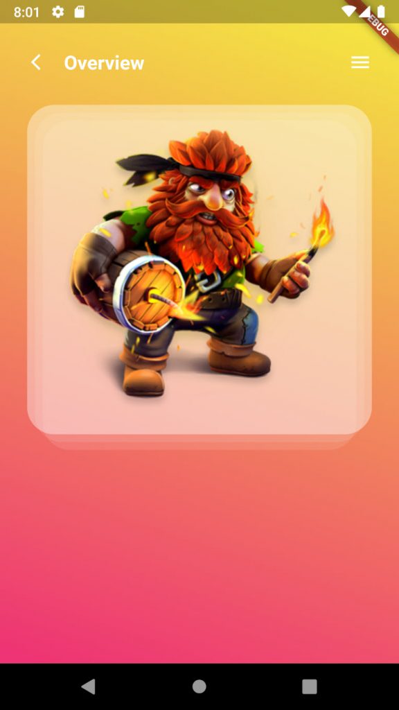
Now, let’s focus on the image section. There are 3 transparent layers and our selected hero image.
For the layers, we can use our previous section’s trick. We can combine 3 Containers using a Stack widget.
Padding(
  padding: const EdgeInsets.all(28.0),
  child: AspectRatio(
    aspectRatio: 1,
    child: Container(
      child: Stack(
        children: [
          Align(
            child: Container(
              margin: EdgeInsets.only(
                left: 16,
                right: 16,
                top: 16,
              ),
              decoration: BoxDecoration(
                color: Colors.white.withOpacity(0.1),
                borderRadius: BorderRadius.all(Radius.circular(28)),
              ),
            ),
            alignment: Alignment.bottomCenter,
          ),
          Align(
            child: Container(
              margin: EdgeInsets.all(8.0),
              decoration: BoxDecoration(
                color: Colors.white.withOpacity(0.1),
                borderRadius: BorderRadius.all(Radius.circular(28)),
              ),
            ),
            alignment: Alignment.bottomCenter,
          ),
          Align(
            child: Container(
              margin: EdgeInsets.only(
                bottom: 16,
              ),
              decoration: BoxDecoration(
                color: Colors.white.withOpacity(0.4),
                borderRadius: BorderRadius.all(Radius.circular(28)),
              ),
            ),
            alignment: Alignment.bottomCenter,
          ),
        ],
      ),
    ),
  ),
);
For the image, we can put it inside the front Container (the last Container):
children: [
  Align(
    child: Container(
      margin: EdgeInsets.only(
        left: 16,
        right: 16,
        top: 16,
      ),
      decoration: BoxDecoration(
        color: Colors.white.withOpacity(0.1),
        borderRadius: BorderRadius.all(Radius.circular(28)),
      ),
    ),
    alignment: Alignment.bottomCenter,
  ),
  Align(
    child: Container(
      margin: EdgeInsets.all(8.0),
      decoration: BoxDecoration(
        color: Colors.white.withOpacity(0.1),
        borderRadius: BorderRadius.all(Radius.circular(28)),
      ),
    ),
    alignment: Alignment.bottomCenter,
  ),
  Align(
    child: Container(
      margin: EdgeInsets.only(
        bottom: 16,
      ),
      decoration: BoxDecoration(
        color: Colors.white.withOpacity(0.4),
        borderRadius: BorderRadius.all(Radius.circular(28)),
      ),
      child: Padding(
        padding: EdgeInsets.all(8),
        child: Center(
          child: Image.network(url),
        ),
      ),
    ),
    alignment: Alignment.bottomCenter,
  ),
],
Hero name
Now it’s time to implement the hero name section:
We can simply implement it by overlapping two Text widgets using a Stack widget:
Stack(
  children: [
    Align(
      alignment: Alignment.bottomCenter,
      child: Text(
        heroName,
        style: TextStyle(
          color: Colors.white,
          fontWeight: FontWeight.bold,
          fontSize: 42,
        ),
      ),
    ),
    Align(
      alignment: Alignment.bottomCenter,
      child: Padding(
        padding: const EdgeInsets.only(bottom: 18.0),
        child: Text(
          heroName,
          style: TextStyle(
            color: Colors.white.withOpacity(0.1),
            fontWeight: FontWeight.bold,
            fontSize: 56,
          ),
        ),
      ),
    )
  ],
),
After that, I added the remaining sections. Because they are not challenging enough, I skipped to explain them. It saves our time 😉
BTW, here is the final result of the second page:
ListView(
  controller: _scrollController,
  padding: EdgeInsets.only(top: appBarHeight),
  children: [
    _HeroDetailsImage(widget.hero.image),
    _HeroDetailsName(widget.hero.name),
    Padding(
      padding: const EdgeInsets.symmetric(horizontal: 22.0, vertical: 12),
      child: Text(
        "Super smash bros ultimate villagers from the animal crossing series. This troops fight most effectively in large group",
        style:
            TextStyle(color: Colors.white, fontSize: 18, fontWeight: FontWeight.w300),
        textAlign: TextAlign.center,
      ),
    ),
    SizedBox(height: 28,),
    Row(
      children: [
        SizedBox(
          width: 28,
        ),
        Expanded(
          child: Container(
            height: 54,
            child: OutlineButton(
              child: new Text(
                'Add Favourite',
                style: TextStyle(
                  color: Colors.white,
                  fontSize: 12,
                ),
              ),
              onPressed: () {},
              color: Colors.white,
              borderSide: BorderSide(
                color: Colors.white,
                width: 1,
              ),
              highlightedBorderColor: Colors.white,
              shape: RoundedRectangleBorder(
                borderRadius: new BorderRadius.circular(30.0),
              ),
            ),
          ),
        ),
        SizedBox(
          width: 14,
        ),
        Expanded(
          child: Container(
            height: 56,
            child: RaisedButton(
              onPressed: () {},
              shape: RoundedRectangleBorder(borderRadius: BorderRadius.circular(80.0)),
              padding: const EdgeInsets.all(0.0),
              child: Ink(
                decoration: const BoxDecoration(
                  gradient: LinearGradient(
                    colors: [
                      Color(0xFFF29758),
                      Color(0xFFEF5D67),
                    ],
                    begin: Alignment.topCenter,
                    end: Alignment.bottomCenter
                  ),
                  borderRadius: BorderRadius.all(Radius.circular(80.0)),
                ),
                child: Container(
                  constraints: const BoxConstraints(minWidth: 88.0, minHeight: 36.0),
                  // min sizes for Material buttons
                  alignment: Alignment.center,
                  child: const Text(
                    'OK',
                    style: TextStyle(color: Colors.white),
                  ),
                ),
              ),
            ),
          ),
        ),
        SizedBox(
          width: 28,
        ),
      ],
    ),
    SizedBox(height: 28,),
  ],
)
Now I wanna use the Hero widget to animate the selected Item into the details page.
And here you go. This is our final result 🙂
You can find the source code here.
Don’t forget to give me feedback in the comments section.
Stay safe!
great
Some truly nice and useful information on this web site, too I think the style has great features.